| Author | Thread |
|
|
10/12/2005 01:10:20 AM |
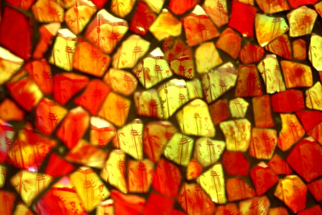
| interesting view, I wondered how this was done..... Excellent intricate design. Overall field composition is superior. Score 7 - and maybe some points off for comp-colour req.... |
|
 Photographer found comment helpful. Photographer found comment helpful. |
Comments Made During the Challenge  |
|
|
10/10/2005 08:27:07 AM |
| The complementary colour for red is green and for yellow is blue-violet. Your photo does not demonstrate complementary colour contrast. Nevertheless it is an interesting abstract arrangement of bright colours and interesting textures. |
|
|
|
10/09/2005 03:45:10 AM |
|
|
|
10/08/2005 10:42:31 PM |
| unusual image, the focus seems randomly distributed expressed which adds to its appeal IMO, though red and yellow aren't complementary colors... |
|
|
|
10/06/2005 12:45:05 PM |
| Interesting picture. hard to see the Pensive theme and the colors aren't very complementary. Intriguing composure and shapes. |
|
| Photographer found comment helpful. |
|
|
10/05/2005 04:38:23 PM |
| I can't see any complementary colors in this, and I am having a difficult time understanding what I am looking at. If abstract is what you are going for, you have succeeded. I do like the shades of red, orange, and yellow. This would make a great fine art print. |
|
|
|
10/05/2005 02:45:50 PM |
| There are no complementary colors. |
|
|
|
10/05/2005 02:22:47 PM |
| It has it's interesting points but it's too blurry to enjoy. |
|
| Photographer found comment helpful. |
|
|
10/05/2005 11:37:18 AM |
|
| Photographer found comment helpful. |
|
|
10/05/2005 04:45:17 AM |
I love it, I am a textured paper collector by a bad habit and this would be a texture to add to the favorites :)
grade: 9! |
|
| Photographer found comment helpful. |
Home -
Challenges -
Community -
League -
Photos -
Cameras -
Lenses -
Learn -
Help -
Terms of Use -
Privacy -
Top ^
DPChallenge, and website content and design, Copyright © 2001-2026 Challenging Technologies, LLC.
All digital photo copyrights belong to the photographers and may not be used without permission.
Current Server Time: 02/01/2026 10:47:51 AM EST.