| Author | Thread |
|
|
11/12/2008 02:06:58 PM |
Complementary colors work very well here
or is it the spot on focus?
Either way - well done! |
|
 Photographer found comment helpful. Photographer found comment helpful. |
Comments Made During the Challenge  |
|
|
10/10/2005 03:40:39 AM |
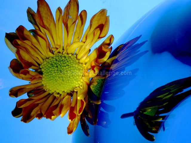
Great close-up shot, but your flower should have had more orangey tones and less green tones to achieve a complementary contrast with the blues surrounding it.
Nevertheless, my complements on a great close-up shot, and a wonderful study in reflections. |
|
| Photographer found comment helpful. |
|
|
10/07/2005 01:16:16 PM |
| I keep wanting to turn my head sideways. |
|
| Photographer found comment helpful. |
|
|
10/06/2005 02:26:40 PM |
|
| Photographer found comment helpful. |
|
|
10/06/2005 12:03:08 PM |
| This one make me stop and look at it for a second. I love the colors here and I love the abstract angle that makes the mind take note. Very nice use of the gradient in the background. |
|
| Photographer found comment helpful. |
|
|
10/05/2005 09:25:20 AM |
| Nice, meets the challenge. |
|
| Photographer found comment helpful. |
|
|
10/05/2005 07:53:51 AM |
| I wish the flower looked more orange. |
|
| Photographer found comment helpful. |
|
|
10/05/2005 07:34:02 AM |
| I"m seeing two primary colors "Yellow & Blue" and one secondary color, Green. None of which have their complements, Purple, Orange, and Red, respectively. These are not complementary colors. |
|
| Photographer found comment helpful. |
|
|
10/05/2005 03:34:04 AM |
|
| Photographer found comment helpful. |
|
|
10/04/2005 09:33:13 PM |
| wow!! this is just so fabulous! |
|
| Photographer found comment helpful. |
Home -
Challenges -
Community -
League -
Photos -
Cameras -
Lenses -
Learn -
Help -
Terms of Use -
Privacy -
Top ^
DPChallenge, and website content and design, Copyright © 2001-2025 Challenging Technologies, LLC.
All digital photo copyrights belong to the photographers and may not be used without permission.
Current Server Time: 04/07/2025 02:44:32 PM EDT.