| Author | Thread |
|
|
10/18/2005 12:24:38 PM |
Greetings from the critique club! :)
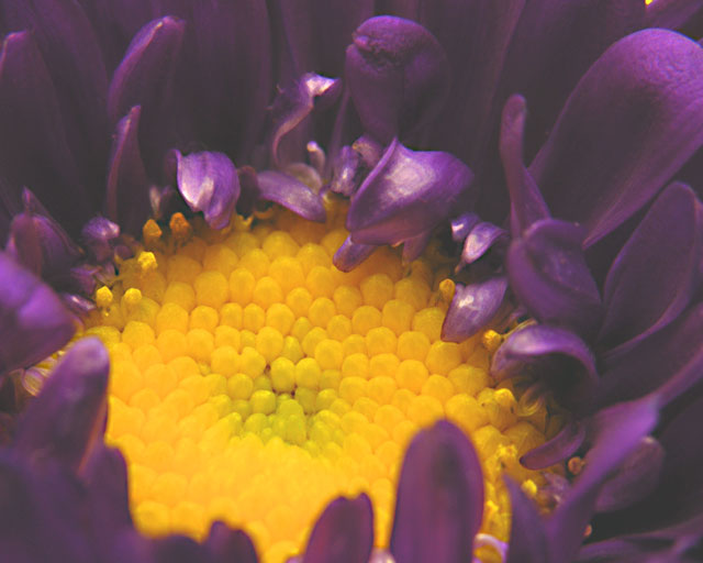
First impression: This looks almost like it was taken through a microscope or something. The petals look plastic, and there's almost TOO much dimensionality here!
Relation to the Challenge: A great use of Complementary Colors. Fits the challenge perfectly.
Composition: As I hinted at in my "First Impression" I don't care for the composition of this shot. I do like the petals in the foreground at the bottom left. They add an element of 'grounding' to the photo. I think with a slightly different angle, or perhaps some out-of-focus background, the shot would feel better. Finally, there's a little bit of yellow at the top right corner of the picture that should either be cropped out or explored further.
Background: Not much to say here, as you didn't use one. I think if you had used a lower angle and included some backdrop (out of focus) it would have given a better feel to the photo. As it is I feel almost like i'm looking through a microscope at the flower.
Photographic Technique: The image seems soft overall, as if there's nothing in focus. That is one of the most troubling aspects to this photo, it lacks overall sharpness. Second, the lighting seems off overall, the reflectivity of the petals just above the center of the flower is distracting. Perhaps this was shot too close to the subject, closer than the minimum focusing distance for your camera/lens?
Post-Processing: No details given, so I can't comment much. I'd suggest some Unsharp Mask to give more definition to the edges of the petals.
Overall Opinion: A good effort, but the technical faults detract too much for it to be a ribbon contender. The subject has a lot of promise, I espically like the texture of the center of the flower, but the lack of sharpness prevents me from exploring it fully.
Finally, I'd like to ask you to consider critiquing the critique. :) Just as you're here to learn about photograpy, I'd like to learn about giving better critiques. If you have any comments, even if it's just "Thanks!" please drop me a PM.
Good Luck with your future entries!
---livitup |
|
 Photographer found comment helpful. Photographer found comment helpful. |
Comments Made During the Challenge  |
|
|
10/11/2005 07:49:38 PM |
| At first glance I thought that the the focus was way too soft, but looking at the image full size, i think that the focus just about fits perfectly. awesome macro! 7 |
|
| Photographer found comment helpful. |
|
|
10/11/2005 05:53:01 PM |
| I like the colors, great contrast. |
|
| Photographer found comment helpful. |
|
|
10/09/2005 11:02:28 AM |
Picture kinda seems a but foggy, and the flower theme is a little overplayed
PRO side - reallly good color and yellow really stands out vs purple. |
|
| Photographer found comment helpful. |
|
|
10/08/2005 12:54:22 PM |
|
| Photographer found comment helpful. |
|
|
10/07/2005 07:15:22 PM |
| Not enough contrast...the colors are nice but too much...lightness. |
|
| Photographer found comment helpful. |
|
|
10/07/2005 06:21:15 PM |
| lighting a little bit off but nice colors |
|
| Photographer found comment helpful. |
|
|
10/07/2005 12:56:53 PM |
| not a crisp image, nice idea |
|
| Photographer found comment helpful. |
|
|
10/06/2005 07:44:20 PM |
| Really nice take on the challenge. The colors are very flat - I think you need a major boost in contrast to make the picture "pop" |
|
| Photographer found comment helpful. |
|
|
10/06/2005 04:58:35 PM |
|
| Photographer found comment helpful. |
|
|
10/06/2005 02:11:21 PM |
| Nice phot, good composition, however the colours look a bit washed out. |
|
| Photographer found comment helpful. |
|
|
10/06/2005 11:33:46 AM |
| Great shot! Beautiful colors! I love it. |
|
| Photographer found comment helpful. |
|
|
10/06/2005 08:56:23 AM |
| a more interesting flower composition than most, but there seems to be a haze across it that dulls the purple |
|
| Photographer found comment helpful. |
|
|
10/06/2005 06:25:22 AM |
| Better lighting could have really made this image "pop" off the screen. As the picture stands the lighting gives it a dull flat look especially to the purples which I envision as really being a deep rich purple hue. Not to mention some of the sheen on the purple petals causes them to appear "plastic". |
|
| Photographer found comment helpful. |
|
|
10/06/2005 03:03:46 AM |
| This is such a good picture except for the lack of focus. Too bad. |
|
| Photographer found comment helpful. |
|
|
10/05/2005 10:03:17 AM |
| to me, ya messed to much with it. You had a possible ribbon if you would have left it natural. But that's me. |
|
| Photographer found comment helpful. |
|
|
10/05/2005 09:47:34 AM |
| I think it�s too blurry, other than that great composition and perfectly fit the challenge |
|
| Photographer found comment helpful. |
|
|
10/05/2005 09:29:48 AM |
| Very dull and washed out. |
|
| Photographer found comment helpful. |
|
|
10/05/2005 07:37:14 AM |
| great colors; i am not exaclty sure where the focus point is though; i wish it would be in the center |
|
| Photographer found comment helpful. |
|
|
10/05/2005 04:45:23 AM |
| This would have been a fantastic photo if the levels in the image had been adjusted so the image was slightly darker. |
|
| Photographer found comment helpful. |
Home -
Challenges -
Community -
League -
Photos -
Cameras -
Lenses -
Learn -
Help -
Terms of Use -
Privacy -
Top ^
DPChallenge, and website content and design, Copyright © 2001-2025 Challenging Technologies, LLC.
All digital photo copyrights belong to the photographers and may not be used without permission.
Current Server Time: 04/07/2025 02:40:10 PM EDT.