| Author | Thread |
Comments Made During the Challenge  |
|
|
10/11/2005 04:22:54 PM |
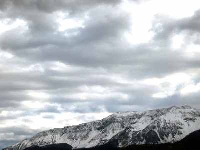
| Have never seen the sky look silver!! |
|
|
|
10/10/2005 02:49:50 PM |
| Complementary shades of gray? |
|
|
|
10/09/2005 06:41:01 PM |
| Nice photo but doesn't seem to meet the challenge. |
|
|
|
10/09/2005 04:15:47 AM |
Did you mean to enter this in the complementary colors challenge? If you did, you missed the mark.
If you intended it for the "Your corner of the world" challenge (which I suspect), I'd probably give it a 4 or maybe a 5, because, despite it's title, it appears to be mostly a picture of a sky, one with nice texture, granted, but a sky with nice texture could be found anywhere. |
|
|
|
10/08/2005 10:36:03 PM |
| Beautiful landscape. Doesn't appear to meet the challenge. |
|
|
|
10/08/2005 11:37:58 AM |
Complementary colours are pairs of colours that contrast strongly when compared to each other.
Black and white are neutrals and not colours at all, and therefore they cannot be complementary colours... white shows the presence of light, and black shows the absence of light. Black and white areas next to each other do demonstrate high contrast, but high contrast gives a different visual effect than complementary colours do in a picture.
Your image demonstrates a duotone effect rather than the effect of complementary colours.
Check some of the forum discussions on complementary colours for suggestions on using colour for contrast.
|
|
|
|
10/07/2005 09:38:16 PM |
| think you forgot that this was about color |
|
|
|
10/06/2005 10:25:16 PM |
|
|
|
10/06/2005 07:38:36 AM |
| I can find no connection between this picture and the challenge subject. |
|
|
|
10/06/2005 12:17:49 AM |
|
|
|
10/05/2005 04:41:50 PM |
| This is a pretty image, but it doesn't represent any complementary colors. |
|
|
|
10/05/2005 12:56:38 PM |
| Does not meet a challenge, way too small, overexposed sky. |
|
|
|
10/05/2005 12:08:20 PM |
| Nice picture. Love the snow/land lines on the mountain top. I don't see any complementary colors though. |
|
|
|
10/05/2005 11:50:45 AM |
| I do not see any complimentary colors. |
|
|
|
10/05/2005 09:56:40 AM |
| Where are the contrasting colors? Black and white are not true colors. The shot is way too small to work effectively. I'd make sure the dimensions are 640 pixels at the highest point and it will create a larger image. This would work better in true black and white with high contrast, but not in this challange. |
|
|
|
10/05/2005 09:45:59 AM |
| Does not meet the challenge |
|
|
|
10/05/2005 07:57:33 AM |
|
Home -
Challenges -
Community -
League -
Photos -
Cameras -
Lenses -
Learn -
Help -
Terms of Use -
Privacy -
Top ^
DPChallenge, and website content and design, Copyright © 2001-2026 Challenging Technologies, LLC.
All digital photo copyrights belong to the photographers and may not be used without permission.
Current Server Time: 02/01/2026 12:03:35 PM EST.