DPChallenge: A Digital Photography Contest You are not logged in. (log in or register
 
Challenge Entries
Portfolio Images
This image is not part of a public portfolio.
Acrylics and oils
Acrylics and oils
UberFish


Photograph Information Photographer's Comments
Challenge: Liquid (Classic Editing)
Camera: Fujifilm FinePix S2 Pro
Location: floor
Date: Jun 3, 2003
Date Uploaded: Jun 3, 2003

lettering is acrylic paint, above it is 3 layers of cd case with a differnt oil on each level (washing up liquid, chain oil and liquid soap. Its a variation on the Ye Olde Watere Dropes thing.

Statistics
Place: 157 out of 202
Avg (all users): 4.2222
Avg (commenters): 4.7143
Avg (participants): 4.2232
Avg (non-participants): 4.2212
Views since voting: 710
Votes: 216
Comments: 8
Favorites: 0


Please log in or register to add your comments!

AuthorThread
06/14/2003 04:19:04 PM
FROM THE CRITIQUE CLUB

Hello, Neil,

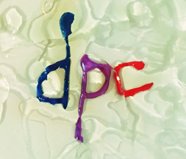
Your picture meets the challenge. I always marvel at all the different things that people think of for the different challenges! I must say that your idea is quite interesting as an idea. Unfortunately, outside of DPChallenge this photo would not "ring a bell" with many people. IMHO even here at DPC it probably is not a photo that will grab many viewer's attention for more than a moment.

I like the colour and the "plastic" look of the letters. IMO, the background (or foreground) is quite interesting, but it might work better if it were sharper, the colours were brighter, and there was a bit more contrast.

Overall, I think this is a good idea and a "gutsy" entry to the challenge. BTW, I love your picture for "From Above" ("Haft Empty or Haft Full"). Take care,

Ursula (uabresch)
Comments, complaints, questions ... feel free to contact me.
 Comments Made During the Challenge
06/10/2003 05:22:52 PM
hmmm.....
06/08/2003 10:41:11 AM
More gutsy than I am. I have a "dpc tribute" shot, but I didn't dare post it for the glass challenge. Good colors, nice mixes. 8
06/07/2003 09:09:38 PM
I like the background, it looks like melting ice.
06/05/2003 11:32:30 AM
I like the idea here but the background doesn't do it for me and it's a bit fuzzy
06/04/2003 05:50:45 PM
personally, I don't like the lettering..... I think you could have perhaps created a better design with the paint, I think this would have worked better with the surface oil(?) to create that disjointed effect...... good luck, Todd.
06/04/2003 01:27:14 AM
Interesting choice of subject. I, er. Well, it meets the challenge, and it goes well with the site... doesn't do much for me personally.
06/03/2003 11:38:57 PM
Trying to win points by sucking up to them upstairs? Would work better if it were sharper.


Home - Challenges - Community - League - Photos - Cameras - Lenses - Learn - Help - Terms of Use - Privacy - Top ^
DPChallenge, and website content and design, Copyright © 2001-2025 Challenging Technologies, LLC.
All digital photo copyrights belong to the photographers and may not be used without permission.
Current Server Time: 04/08/2025 01:29:48 AM EDT.