| Author | Thread |
|
|
07/26/2009 07:27:12 PM |
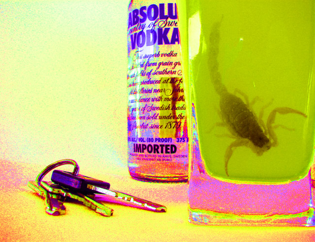
| a sting in the tail. with these colours, i would say you are more going along the lines of a drug induced drunk lover teh saturation and your message comes across about the drink driving |
|
 Photographer found comment helpful. Photographer found comment helpful. |
|
|
10/08/2005 11:51:49 AM |
Of your alternate versions, the orange works best because it has the most containment of the saturation. In other words, the saturation is left to the liquid rather than to the keys, bottle, and background. (Yes, there is some, but it looks fairly natural).
I'd like that one best. |
|
| Photographer found comment helpful. |
|
|
10/05/2005 08:54:21 PM |
Alternate versions of this pic are:
  
Please feel free to comment on the alternate versions as well.
Thanks! |
|
|
|
10/04/2005 09:58:07 PM |
| It was bold of you to submit something so heavily worked to this challenge. I still like the idea and the colors. If you could have gotten the colors fields to be even instead of grainy, this would look really cool. Maybe some combination of blur, cutout filter, and noise removal? I dunno. good luck with the next challenge. |
|
| Photographer found comment helpful. |
Comments Made During the Challenge  |
|
|
10/02/2005 02:44:53 PM |
| Good comp & I like the boldness of the colors. cool image! |
|
| Photographer found comment helpful. |
|
|
10/01/2005 05:58:01 PM |
| Creative -- I like the colors -- and the composition is laid out well -- but overall a bit too processed for my taste -- |
|
| Photographer found comment helpful. |
|
|
10/01/2005 03:17:25 PM |
| I'm not sure that I'm particularly fond of the "effect," but I rather like the idea. |
|
| Photographer found comment helpful. |
|
|
10/01/2005 10:25:32 AM |
| The scorpion is a little too disgusting inside a drink and you can see all the dots that make up the photo. |
|
|
|
10/01/2005 09:59:44 AM |
| what happened to the colors? |
|
|
|
10/01/2005 07:43:14 AM |
| I wonder how well this would have worked w/o the extreme saturation? |
|
| Photographer found comment helpful. |
|
|
10/01/2005 07:06:12 AM |
| Not sure why the keys are there. Is this supposed to promote drinking and driving? Other than that it's kinda cool. |
|
| Photographer found comment helpful. |
|
|
10/01/2005 12:55:06 AM |
|
| Photographer found comment helpful. |
|
|
09/30/2005 12:13:38 PM |
| While I think the composition is good and the story is there, the Digital Art look of this image is distracting to me. |
|
| Photographer found comment helpful. |
|
|
09/30/2005 09:54:18 AM |
| nice... but too much worked!!!! |
|
| Photographer found comment helpful. |
|
|
09/29/2005 05:35:25 PM |
| I don't like the freaky colours. Does not add to the image. |
|
| Photographer found comment helpful. |
|
|
09/29/2005 02:07:17 PM |
ah, scorpions are always good :)
I think that the posterization works pretty well here--conceptually--but it's too rough to really look like a professional presentation. |
|
| Photographer found comment helpful. |
|
|
09/28/2005 07:48:02 PM |
| Yeah...that's pretty nasty alright. I'm not a fan of post-editing filters (guess I'm kind of a photo purist, if you will). The noise doesn't bother me as much, but it's the lack of noise on the glass and the scorpion. Good composition though. |
|
| Photographer found comment helpful. |
|
|
09/28/2005 04:19:45 PM |
| Whoa. Not sure what else I can say about the over-processing here... |
|
|
|
09/28/2005 04:02:14 PM |
| If the coloring was regular then this picture would be really good. The bright neon colors are just a bit too distracting. |
|
| Photographer found comment helpful. |
|
|
09/28/2005 08:24:22 AM |
| I'm not sure I like the effects that you put on it but I like the message. |
|
| Photographer found comment helpful. |
|
|
09/28/2005 12:32:46 AM |
|
| Photographer found comment helpful. |
|
|
09/27/2005 09:26:51 PM |
| mmm, I don't think the super saturation is gonna fly... |
|
| Photographer found comment helpful. |
Home -
Challenges -
Community -
League -
Photos -
Cameras -
Lenses -
Learn -
Help -
Terms of Use -
Privacy -
Top ^
DPChallenge, and website content and design, Copyright © 2001-2025 Challenging Technologies, LLC.
All digital photo copyrights belong to the photographers and may not be used without permission.
Current Server Time: 04/07/2025 01:48:54 PM EDT.