| Author | Thread |
Comments Made During the Challenge  |
|
|
06/10/2003 09:48:39 PM |
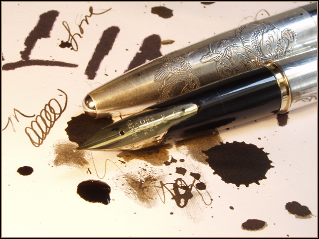
| Fun, busy image, but busy in a good sense with lots to look at that contrast the sleek lines of the pens. |
|
 Photographer found comment helpful. Photographer found comment helpful. |
|
|
06/10/2003 09:28:51 PM |
| I don't like pics which seem too commerical. |
|
|
|
06/10/2003 10:58:44 AM |
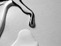
Just when I thought there were no good photos this week and my eyes were crying in pain...I find this ! Amazing photo. The lighting is superb as well as the composition. I love it ! Awesome idea and well done. This has to be my fav ! A perfect 10 !
|
|
| Photographer found comment helpful. |
|
|
06/09/2003 04:35:49 PM |
| I like the blots and scribbles. Nice shot |
|
| Photographer found comment helpful. |
|
|
06/08/2003 05:31:54 AM |
| Nice detail in the pen. I think this could have been more effective if the pen were lying next to, instead of on top of, the ink blots, which kind of blends in with the dark blue of the pen. |
|
|
|
06/08/2003 04:59:03 AM |
| I like the idea and the pen is gorgeous. The semi-candid look is a nice touch. Just a touch more focus on the wet ink (or a touch more wet ink) would have helped in terms of challenge-meeting. |
|
|
|
06/07/2003 09:20:14 PM |
| I think some ink in an inkwell next to the pen would be great. |
|
| Photographer found comment helpful. |
|
|
06/07/2003 02:55:09 PM |
| I think I would have liked a tighter shot on one of the ink blots with the brass nib penetrating the composition from one of the sides or corners. I find the fingerprints in the ink intriguing. Also the different saturations of the ink and the differences between the dark blots, the random arcs, the lighter spills and the drying ink might make a more powerful composition without the curls on the left side or the writing (the M and the word Love). I definitely like the subject matter. I just think I would have tightened the focus either the ink or the pens with a single blot. I'd like to see your whole series on this subject. |
|
| Photographer found comment helpful. |
|
|
06/05/2003 12:14:05 AM |
| Creative idea, and nice composition. The colors seem just a little bland, but that does not detract too much. |
|
| Photographer found comment helpful. |
|
|
06/04/2003 03:39:03 PM |
| good color scheme...nice set up,,,pleasing to look at .....no WOW factor 8 syamjonimi |
|
| Photographer found comment helpful. |
|
|
06/04/2003 03:00:35 AM |
| I came to this photo because the thumbnail promised a lovely sense of confusion and mess. Upon seeing the full image, though, I feel that the planning is too evident, no-one would put lovely, old pens on ink blots deliberately. I was hoping to see the result of an accidental spill. The low mark I'm giving, therefore, probably reflects my own disappointment as much as anything else. |
|
| Photographer found comment helpful. |
|
|
06/04/2003 01:34:59 AM |
| good idea. i think a different composition would be nice.. something cleaner.. with maybe some writing and one good "blot"... also only need one pen and shouldnt place it right in the middle.. maybe off to the side |
|
| Photographer found comment helpful. |
Home -
Challenges -
Community -
League -
Photos -
Cameras -
Lenses -
Learn -
Help -
Terms of Use -
Privacy -
Top ^
DPChallenge, and website content and design, Copyright © 2001-2026 Challenging Technologies, LLC.
All digital photo copyrights belong to the photographers and may not be used without permission.
Current Server Time: 02/01/2026 08:52:40 AM EST.