| Author | Thread |
|
|
10/16/2005 11:12:19 AM |
| Congratulations woutje. I gave this a 10. |
|
 Photographer found comment helpful. Photographer found comment helpful. |
|
|
10/06/2005 01:10:16 AM |
Greetings from the Critique Club...
Hi woutje...
I press the 'give me an image to critique' button around here occasionally. I'm usually immediately blasted with some lame photograph that appears to have no rhyme or reason to it other than meeting the challenge. Sometimes the challenge is even sketchy in the image. I actually voted on this challenge, and I gave this photo a 10. I liked it just as much as the photo that got first place.
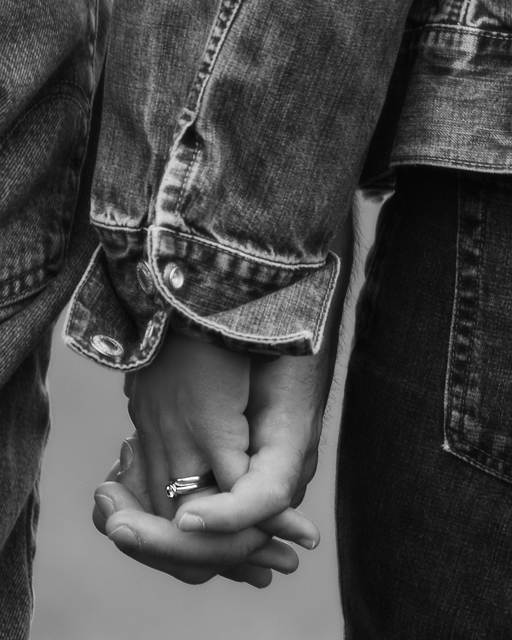
I can't really offer you much critique. I like the image just the way it is. All I can do is offer you some ideas that you may not have thought about. I like to evaluate post processing choices. When I modify a photograph, I do it for a reason usually. I am also a fan of black and white. I think removing the color from this image was probably a strong choice. When you can have a successful image with the color removed, you know you have a strong subject and composition. Color often distracts a viewer from the subtleties of a photo that actually create the impact of the image.
This image is about love. The image projects the feeling of love very nicely. Black and white, in most cases, projects a cool or cold feeling. In your case, it doesn't really do that so much because of the subject. I believe you could warm the image up somewhat with a little additional color toning such as a sepia or a very faint red. It may be worth some experimenting :)
Congrats on a great score...
John Setzler
|
|
| Photographer found comment helpful. |
|
|
10/03/2005 10:15:15 PM |
| Congratulations on your top 5 finish with this Valentine. |
|
| Photographer found comment helpful. |
|
|
10/03/2005 01:38:44 PM |
| Beautiful shot - congrats on your top 10 finish. |
|
| Photographer found comment helpful. |
|
|
10/03/2005 07:53:04 AM |
| Very nice shot Richard. Congrats. on your 6th place win and in only 6 challenges entered. (I'm seeing a trend here, the 5th place did the same thing) |
|
| Photographer found comment helpful. |
|
|
10/03/2005 12:35:15 AM |
| Great job on this, Richard. Big congrats on your top ten finish! |
|
| Photographer found comment helpful. |
|
|
10/03/2005 12:01:59 AM |
| Good job. One of my highest scores! Congrats. |
|
| Photographer found comment helpful. |
Comments Made During the Challenge  |
|
|
10/02/2005 08:40:28 PM |
|
|
|
10/02/2005 11:37:33 AM |
| Nice shot. Love how that band pops out at you. |
|
| Photographer found comment helpful. |
|
|
10/01/2005 02:34:11 PM |
|
|
|
09/30/2005 06:59:47 PM |
| A wonderful image, well done! |
|
|
|
09/30/2005 10:52:55 AM |
| Great Shot! Very emotive! - 9 |
|
| Photographer found comment helpful. |
|
|
09/29/2005 10:26:30 PM |
| Nice shot. Great for an anniversary card. My only change might be to have more centered / even amounts of the two people. |
|
| Photographer found comment helpful. |
|
|
09/29/2005 06:06:35 PM |
Simple & effective.
Sometimes the simplest subject matters work best.
Well done. (7) |
|
| Photographer found comment helpful. |
|
|
09/29/2005 07:39:33 AM |
| Very cool, emotive image. I like it. Good choice for b/w. |
|
| Photographer found comment helpful. |
|
|
09/29/2005 12:18:47 AM |
| I'm sorry to say this but the hairs on the back of his hand look totally werewolfish to me. I keep coming back to them the more I look at the picture. It's otherwise very nicely done, but I keep fixating on those hairs... |
|
| Photographer found comment helpful. |
|
|
09/27/2005 03:25:59 PM |
| I can really see this as a card. great shot. |
|
| Photographer found comment helpful. |
|
|
09/27/2005 10:12:05 AM |
| very nice, great crop, and love the denim texture |
|
| Photographer found comment helpful. |
|
|
09/26/2005 11:04:03 PM |
| very cool shot...i would definitley buy this greeting card |
|
|
|
09/26/2005 12:53:43 PM |
| The rings are almost in the "rule of thirds" spot, and taking them a little higher would open up more blank space. The thing that jumps out at me first though, is the shirt sleeve and cuff. It took me a minute to notice the rings. I like the concept though. |
|
| Photographer found comment helpful. |
|
|
09/26/2005 08:53:40 AM |
| Perfect for the title. I like that you chose to use black and white. That little sparkle from the ring draws your eye to the perfect place - to realize it's a wedding ring, thus the anniversary category. Nicely done. |
|
| Photographer found comment helpful. |
|
|
09/26/2005 03:40:13 AM |
| Sweet & well executed. Can't say anything negative about it. :) |
|
|
|
09/26/2005 01:04:02 AM |
| I really like this, the b&w really accentuates this shot. Good Luck 9 |
|
| Photographer found comment helpful. |
Home -
Challenges -
Community -
League -
Photos -
Cameras -
Lenses -
Learn -
Help -
Terms of Use -
Privacy -
Top ^
DPChallenge, and website content and design, Copyright © 2001-2026 Challenging Technologies, LLC.
All digital photo copyrights belong to the photographers and may not be used without permission.
Current Server Time: 02/01/2026 07:04:05 AM EST.