::: Critique club :::
Part of the enjoyment of CC is being able to spend time with an image and explore it in greater depth than the usual passing glance.
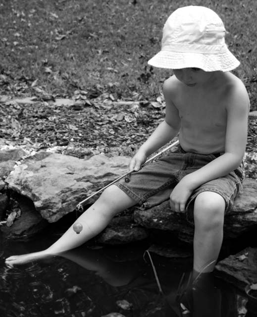
In this case, it probably wouldn't have meant very much without the greeting card category. But that *is* what this challenge is all about and so the B&W which at first appears inappropriate, is in context. The result is wonderfully melancholy and poignant.
Pictures of children always attract and 'sells' as the picture editor of any daily newspaper will tell you. When you study this little guy in the context of the category, he looks melancholy, he looks reflective, he looks like hes not really fishing, he looks like he's dreaming. Yes, some of that reaction is by power of suggestion from the title - but isn't that what this is all about? Photographs are a communication and this one does it very well.
So is it perfect? No photograph is. Can this one be improved? Probably but I can't for the life of me think how. I wasn't particualrly attracted to the image at forst. It doesn't have a wow factor, it's not cleverly coloured or post-produced with the sole design of winning. It is a simple picture, simply shot with a simple message and it works. Because of the balance in the composition from his right leg, I don't even think that re-cropping so that his torso fell on the vertical thirds line would make a great deal of difference.
The exposure of low contrast and soft halftones is also appropriate for the title and the card category.
This photograph is not a "star" and I believe it would be inappropriate for it to be so. It is an underrated well crafted communication. Well done
Brett |