| Author | Thread |
Comments Made During the Challenge  |
|
|
09/25/2005 04:55:18 AM |
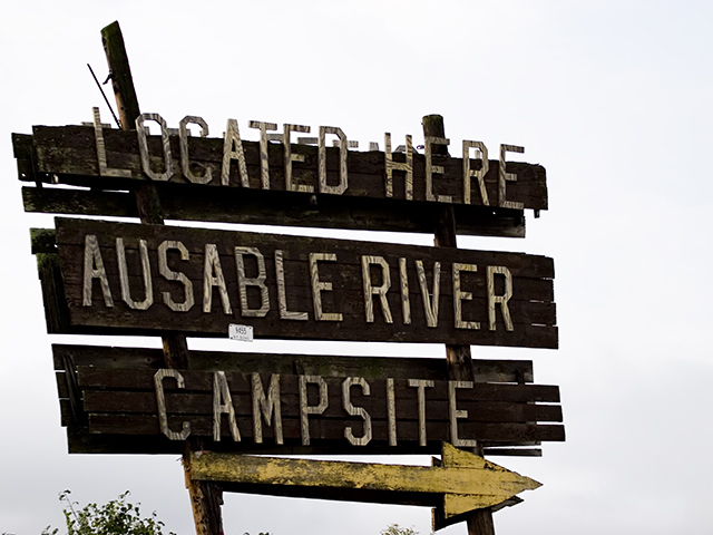
| Interesting picture. I really like the sign and the rustic look it has but the bush at the bottom is a bit distracting and not big enough to compliment the picture. The background is off too. Maybe cropping some of the white space out would leave the focus on the sign then the bush wouldn't be such a distraction too. |
|
|
|
09/22/2005 09:41:13 AM |
| Funny, but IMHO lacks visual interest. The sky is too bright. |
|
|
|
09/21/2005 08:45:29 AM |
| It looks a bit dark on my monitor, and I wish there was a bit more variance in the background sky, but nice idea for the challenge. |
|
|
|
09/19/2005 03:28:02 PM |
|
|
|
09/19/2005 08:02:43 AM |
| I would rather see a picture of the campsites and have Ausable Rier Campsite as the title. While technically OK, there is no emotion or interest in the composition. |
|
|
|
09/19/2005 06:16:56 AM |
| heh, where in the heck is that? |
|
Home -
Challenges -
Community -
League -
Photos -
Cameras -
Lenses -
Learn -
Help -
Terms of Use -
Privacy -
Top ^
DPChallenge, and website content and design, Copyright © 2001-2025 Challenging Technologies, LLC.
All digital photo copyrights belong to the photographers and may not be used without permission.
Current Server Time: 04/07/2025 01:43:23 PM EDT.