| Author | Thread |
Comments Made During the Challenge  |
|
|
09/27/2005 01:48:58 AM |
| does not tell me anything |
|
 Photographer found comment helpful. Photographer found comment helpful. |
|
|
09/26/2005 06:15:43 PM |
| I find this framing takes away the quality of this otherwise very original and strong image. |
|
| Photographer found comment helpful. |
|
|
09/26/2005 02:59:00 AM |
| Too regular, did not like "tile looking", black and white, totaly centered idea. Not to my taste, sorry. |
|
| Photographer found comment helpful. |
|
|
09/25/2005 05:33:36 PM |
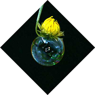
| Cute image. I like the uniqueness of it. Good color and the bubble is nicely deliniated. I like the composition as far as using the curved flower coming from out of the top of the image, but I'm afraid the choice of bordering ruins it for me. The white totally overwhelms the image and the sharp contrast draws me out of what should be the focal point of the photograph (the flower/bubble) and instead thrusts me into the play of the black and white against each other. I gave a 4. |
|
| Photographer found comment helpful. |
|
|
09/24/2005 11:50:42 AM |
|
| Photographer found comment helpful. |
|
|
09/23/2005 10:02:06 PM |
| Flies in the face if the Rule of Thirds - and works |
|
| Photographer found comment helpful. |
|
|
09/23/2005 08:56:19 PM |
|
| Photographer found comment helpful. |
|
|
09/23/2005 10:29:26 AM |
| i don't really like the framing and think the photo would have had a lot more impact at its proper angle |
|
| Photographer found comment helpful. |
|
|
09/22/2005 03:51:32 PM |
| 4 - Probably not the only one saying this, but the rotation 'diminishes' this shot in my opinion. Whatever way is right side up, I think would have made a much better, and perhaps unique in this Challenge, shot. |
|
| Photographer found comment helpful. |
|
|
09/22/2005 04:33:29 AM |
| I can appreciate the artistic effort of the diamond shape, but for me, the white is too overpowering and overshadows the nice composition of the flower and bubble. |
|
| Photographer found comment helpful. |
|
|
09/21/2005 08:48:09 AM |
| love the phot but IMO the border spoils it. |
|
| Photographer found comment helpful. |
|
|
09/21/2005 07:47:07 AM |
The composition of the elements is definately interesting but I think that the border is a little too much. Yes it does make the composition pop off the page but I think that if there was a little more dimension to the edges of the "black box area" it would move it out of the realm of flat and give it a third dimension and some depth....I am thinking that if the shot could have been accomplished with a box where the inside is deep black and the outside is white....just a random thought.
Back to the composition. I like how you have the flower curved such that it looks as if it is resting comfortabley on the bubble. The bubble is in focus but some of the details in the seperation in the flower petals are lost - it needs to be in focus better to improve sharpness so that we can appreciate the beauty of the flower as well as the bubble. |
|
| Photographer found comment helpful. |
|
|
09/21/2005 07:36:23 AM |
| Wishing this was all black instead of having a border but very nice picture |
|
|
|
09/21/2005 06:42:18 AM |
| I don't care for the setup. |
|
Home -
Challenges -
Community -
League -
Photos -
Cameras -
Lenses -
Learn -
Help -
Terms of Use -
Privacy -
Top ^
DPChallenge, and website content and design, Copyright © 2001-2025 Challenging Technologies, LLC.
All digital photo copyrights belong to the photographers and may not be used without permission.
Current Server Time: 04/07/2025 01:44:24 PM EDT.