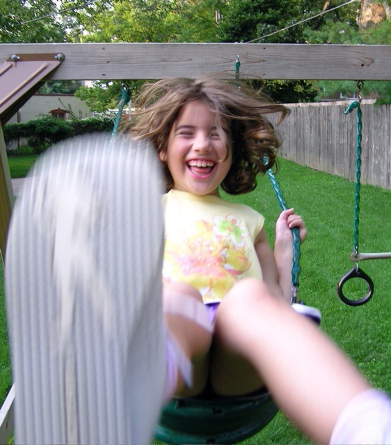
Taken of my little sister on a swing. I set up a ladder as close to the swing as I safely could, and sat on it while she swung. Her laughing was because she kept almost kicking me.
The biggest pain with this shot was shutter lag, and an unacceptably slow autofocus on my camera, so I had to set manual focus, but I still think that the shot isn't quite focused right. (my goal, of course was for her face to be in focus)
I picked this shot because I liked the composition with the foot up and blured, and it had the best expression.
All post edditing was done in iphoto, because the computer I am working on has yet to have photoshop installed.
I'm hoping that this will do well, but people ma dislike the few power lines visible at the very top of the frame, as well as the fence, and the house.
I wonder if anyone wll comment about the basketball hoop
Statistics
Place: 456 out of 544 Avg (all users): 4.6023 Avg (commenters): 5.0000 Avg (participants): 4.4476 Avg (non-participants): 4.7851 Views since voting: 747 Views during voting: 387 Votes: 264 Comments: 8 Favorites: 0
In hindsight, I probably shuld have cropped out the area above the swing, but why I chose not to (I had considered it) was because without any negative space above, it looks like my sister is just going to bump into the top of the frame, dulling the action. I was also afraid that people may not realize that it's a swing if they couldn't tell that it was a beam instead of a wall.
Just reading your comments, and those of the commenters, I think you're being a little hard on yourself. This is a cool photo. It didn't do all that well in the challenge, but the small number of comments tell me that most voters didn't 'get' it rather than thought there were flaws in the image.
It would have been really neat to have the background more out of focus.. As you noted in your comments it's a little busy maybe, but your sisters expression and the big kick to the head more than make up for that!
The exposure is good, with only the small white sky highlights top right distracting my eye from the energy and motion in the shot. The colours are great as well, the strong greens and skintone are pleasing to the eye, with nothing challenging to grasp for the viewer.
The only thing I find disturbing is that the top of the photo is cut off by the frame for the swing. It's almost as if there are two photos here, the one above and the one below. Cropping off the top of the image, keeping most of the wooden framing makes this more balanced to my eye.
I think this image suffered in the voting because people didn't get 'perspective' from the photo. That asside you obviously saw what you wanted, and captured it perfectly. Well done.
Good shot, but there's nothing stylish or appealing. Try photographing in a different location with swings, and take an image like this at high contrast in B&W.