| Author | Thread |
|
|
09/22/2005 04:35:30 PM |
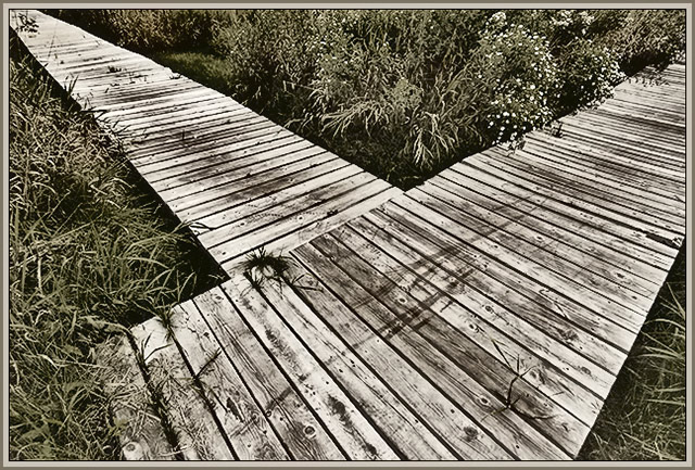
I didn't get to vote on 100% of this challenge so no "actual" score. I would have scored it on the high side for a few reasons:
- placement of the main element is great (central and yet not symetrical)
- it's an interesting tone and the muted colors give it a woody, hushed feel
- post processing shows care and an artistic touch
Only (very small) negative, the clump in the center detracts from the simple lines.
Theresa |
|
Comments Made During the Challenge  |
|
|
09/20/2005 01:01:21 PM |
| One of my favorites in this comp. Nice nice job. Great lines and comp. |
|
|
|
09/20/2005 06:01:13 AM |
|
|
|
09/15/2005 08:09:30 PM |
| Really like this picture. And the perspective is good. Great job. |
|
|
|
09/14/2005 08:34:43 PM |
| This is a very interesting picture because of the lines that the planks make, it also has a nice weathered color to it. |
|
|
|
09/14/2005 02:25:35 PM |
| I love the tones and desat of this photo. Nice leading lines entry too! |
|
|
|
09/14/2005 11:28:37 AM |
|
|
|
09/14/2005 06:00:29 AM |
|
|
|
09/14/2005 12:07:52 AM |
| Good eye...I really like this one. Nice lines and framed well. One thing...I don't really like that the boardwalk ends before the picture does on the left. 9 |
|
Home -
Challenges -
Community -
League -
Photos -
Cameras -
Lenses -
Learn -
Help -
Terms of Use -
Privacy -
Top ^
DPChallenge, and website content and design, Copyright © 2001-2026 Challenging Technologies, LLC.
All digital photo copyrights belong to the photographers and may not be used without permission.
Current Server Time: 02/01/2026 09:05:48 AM EST.