| Author | Thread |
Comments Made During the Challenge  |
|
|
09/18/2005 07:19:14 PM |
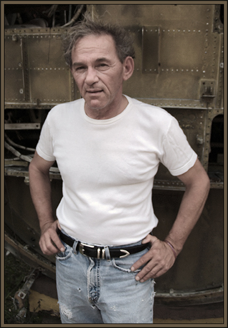
| wish this was a little sharper, and added contrast would help set him off ffrom the background some. Still a nice shot |
|
|
|
09/16/2005 07:39:59 PM |
This beat up old man has not combed his thinning hair for two days. Focus is soft....... use a tripod. yup this is me.
Message edited by author 2005-09-19 19:46:45. |
|
|
|
09/15/2005 10:06:30 PM |
| cool pose, like the insight into his pesonality - more contrast would make this stronger for me, maybe shoot at his eye level - |
|
|
|
09/14/2005 04:36:23 PM |
| great image with loads of personality... tones are perfect for this subject... well done... :) |
|
|
|
09/14/2005 04:10:10 PM |
| Shot seems to suffer from being out of focus. |
|
|
|
09/14/2005 03:48:37 PM |
| Hey, I have pants just like those. |
|
|
|
09/14/2005 02:51:27 PM |
| I love the image and the colors, but he seems a bit OOF. |
|
|
|
09/14/2005 01:18:59 AM |
| Great charachter - lighting could have been better |
|
|
|
09/13/2005 09:45:56 PM |
| i like the background on this shot, he looks like some sort of worker... however the title doesnt help me figure out whats going on... still a great shot, a more helpful title would have been good, but o well |
|
|
|
09/13/2005 09:18:42 PM |
| Good shot, I really like the overall feel. |
|
|
|
09/12/2005 03:43:33 PM |
| This portrait says to me that this man has had a hard life. The background fits with his appearance. For me, I wish the colors were a bit...brighter and not so muted, but I still think it's a good portrait. |
|
|
|
09/12/2005 10:48:22 AM |
| to me, the shot needed to be in full color, reducing the color takes away from the shot, single toned face just dosen't do it for a color portrait. |
|
|
|
09/12/2005 10:19:48 AM |
| Looks like a character! I think the shot looks a little washed out, though, but an interesting background. |
|
|
|
09/12/2005 08:36:53 AM |
| The shot looks good - exposed well and he seems dressed appropriate for his surroundings so it sets a complimentary scene. As a 'stranger' viewing the image it doesnt hold a lot of interest for me nor have much of an impact, but it works as a portrait. Only technical issue is that it could do with being a little sharper. |
|
|
|
09/12/2005 04:23:34 AM |
| Tighter crop form the botom would have worked much better for me. His face looks interesting but it's not dominant enough. |
|
|
|
09/12/2005 02:15:56 AM |
| Would love this as a black and white. |
|
|
|
09/11/2005 09:07:31 PM |
| Nice rugged picture. Would like to see the picture a little sharper. |
|
|
|
09/11/2005 08:58:33 PM |
| Great mood, and color coordination. I like this, it feels very real. |
|
Home -
Challenges -
Community -
League -
Photos -
Cameras -
Lenses -
Learn -
Help -
Terms of Use -
Privacy -
Top ^
DPChallenge, and website content and design, Copyright © 2001-2025 Challenging Technologies, LLC.
All digital photo copyrights belong to the photographers and may not be used without permission.
Current Server Time: 04/08/2025 05:05:19 AM EDT.