| Author | Thread |
|
|
09/24/2005 04:19:04 AM |
Just wanted to reply here to your reply so that you can have it for perpetuity...
Your response:
>Thank you for your critique but I can't say I agree with everything
>you have said.. If you’re right about your cropping job then one of
>the best portrait photographers in the world isn't any good.. I took
>this idea from Annie Leibovitz. Yes I missed the fact that my helper
>dropped the reflector and I had lost the fill light. But with the
>subject in the center of the frame it gives him the most power. I was
If you would really spend a lot of time examining Annie Leibovitz' photographs (good site with several examples: //www.temple.edu/photo/photographers/leibovitz/photos.html, you would actually see very FEW of them having a centered composition and those that do have it, have it that way for a reason (symmetry in the photo, dominance of the subject). Good one for you to examine would be number 10 of the surfer. Notice how he is centered, there is landscape behind him, but yet he is dominant in the photo, and the other elements do not detract from him. BTW, I think my favorite of hers is her photo of Whoopi Goldberg in the bathtub filled with milk.
Center framing is powerful only when the subject is strong enough to hold that dominant position. Unfortunately in your photograph, the subject is NOT dominant, rather he is in a secondary role to the landscape which is overpowering him. This is doubly true not only to the size he is in relation to the landscape, but also to his darkness in comparison to the landscape.
>in a rush for getting this in by the deadline but after reflection I
>see a few things I would have done differently like balance the
>horizon line in balance with his waist. Also bring my model even more
>into the frame it would have enforced his presence..
This is the probably the biggest thing that would have helped your 'color portrait' is to focus in on the individual. I didn't mention the leveling of the horizon, since it is a minor thing that can easily be fixed in post-processing with a slight rotational adjustment, and the other problems seemed much greater.
>Again thank you for your critique but I find most people how suggest >setting fire to a field to get a wow effect they are not looking at >the full image..
If you think I meant for you to start a fire in the field simply to give your photo the wow factor, then you are mistaken. However, had you happened upon a field that a farmer was burning, or some other fire that would be the wow factor that would tie your subject (the firefighter) to the background (the fire). There is a connection. In this photo, there is no connection between the subject (firefighter) and the background (landscape).
Last thing I would suggest for you would be to check people's comments as helpful. This is the polite way to say, "I have read your comment, I see what you mean." It seems like you are really only checking the comments of those you agree with. But to only say 19 out of 63 comments you have received are helpful is pushing it. Especially when you have multiple people telling you the same thing.
Have a nice day.
Message edited by author 2005-09-24 04:22:06. |
|
|
|
09/22/2005 04:40:17 AM |
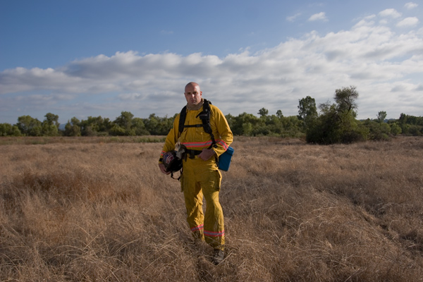
Greetings from the Critique Club
We have here what could turn into two separate photos. The firefighter and the landscape. I do think you got the exposure right for the landscape.
However, this was a challenge for a Color Portrait, and the focus needs to be on the person, with portraits specifically focusing in on the face and eyes. This may be the primary reason that your photo scored low, in that we cannot even see this man's eyes, rather they appear just as black shadowed spaces.
Just a couple of suggestions that might help the photo:
1. Move closer/Crop. I understand your wanting to get the full outfit/person into your photo. However, what has happened here is that you have allowed the landscape/sky to become dominant in the photo. This means that you need to move in and allow the man to become the dominant part of the photo. A crop like this would help:

This crop also helps to move him off the 'dead' center and to the right third to place him in a more dynamic position.
2. Lighting/exposure: As I said, your camera exposed great for the landscape, but unfortunately, the firefighter is not exposed well at all, he is dark and in shadows. If you notice, the light is coming from the back right, which makes him totally in shadows. the light would be better if it was 45 degrees to your back right instead so that he would have some light shining on his front side. You used a reflector, but the reflector didn't have enough strength to overcome the bright sky/landscape, so he still remains dark. A fill flash would help in this situation to shine more light on him.
Overall conclusion: I have to agree with the voters on this picture, I would have scored it either a 3 or a 4. If the crop came in on him, would immediately jump to a 5, proper lighting and exposure would be a 6. Add a fire to the background, and the 'wow' factor would jump it up to a winner :-)
If you have any questions about this critique, feel free to PM me. |
|
Comments Made During the Challenge  |
|
|
09/16/2005 09:29:06 PM |
Why fire Mark? He's been doing a good job. If anyone should be fired, it's Bruce. ;-)
Ok, about the picture. I'm probably not the first to say it, but isn't the figure too centrally located? Perhaps crop off some of the left side. |
|
|
|
09/16/2005 01:47:47 AM |
| take five steps closer and I love this! This feels like a journalistic shot on fire danger, closer you have a portrait of a man in his environment - hope that's helpful |
|
 Photographer found comment helpful. Photographer found comment helpful. |
|
|
09/15/2005 04:30:26 PM |
| Great background, but I can't really see much of him. I understand wanting the uniform in the shot, but we lose any sense of him as an individual here. |
|
|
|
09/15/2005 08:22:44 AM |
| face is too dark. cropping needs to be tighter. background is uninteresting to warrant so much space. |
|
|
|
09/14/2005 10:58:40 PM |
| Nice portrait, I would have like seen Mark just a little closer. |
|
|
|
09/14/2005 09:29:48 PM |
| hey ive worked with these guys down in the everglades.. it was during the shoot of a CSI miami episode, the one the convict burns down the everglades... anyway nice photo though i with you could see his face more.. some bounce opposite of the sun wouldve been great |
|
| Photographer found comment helpful. |
|
|
09/14/2005 12:53:47 PM |
| As a portrait I would have cropped this much tighter or taken more of a close up. |
|
|
|
09/13/2005 10:35:19 PM |
| For me, I wish the photo had less space and was cropped closer to the main subject. He seems to get..."lost" amongst the land for me. |
|
|
|
09/13/2005 04:38:52 PM |
| Very good idea to have a fireman for a model. I only wish he was placed off centre though. Lovely scenery behind him. Send my best wishes to him for doing such an important job. |
|
|
|
09/13/2005 01:14:09 PM |
| I would like to see more of his face. This to me is a picture not a portrait. |
|
|
|
09/13/2005 12:15:49 PM |
| a little closer would be nice. |
|
|
|
09/12/2005 10:48:56 PM |
| Nice, I think it might benefit from a tighter framing of the subject. |
|
|
|
09/12/2005 10:03:33 PM |
| I'd like to have seen your subject closer in. The colors are a little muddy as well. Could have used some sharpening or contrast adjustment. |
|
|
|
09/12/2005 04:42:54 PM |
| maybe should have cropped a little closer |
|
|
|
09/12/2005 12:48:29 PM |
| A portrait of landscape with a fireman standing in it. |
|
|
|
09/12/2005 10:47:50 AM |
| I like the landscape which adds a lot to the subject. |
|
| Photographer found comment helpful. |
|
|
09/12/2005 10:40:22 AM |
| Great subject and location, but I think some more thought given to composition would really help as would a bit of fill. |
|
| Photographer found comment helpful. |
|
|
09/12/2005 09:23:31 AM |
| I recommend trying a number of angles with the light. If you have a flash (might need to be closer) it sometimes helps to use it even in daylight. |
|
| Photographer found comment helpful. |
|
|
09/12/2005 09:00:43 AM |
| As a general rule for people portraits, closer is better. The surroundings don't add anything to the portrait. |
|
|
|
09/12/2005 05:29:26 AM |
| Could be this monitor- but it seems a little too dark? Nice portrait though :D |
|
Home -
Challenges -
Community -
League -
Photos -
Cameras -
Lenses -
Learn -
Help -
Terms of Use -
Privacy -
Top ^
DPChallenge, and website content and design, Copyright © 2001-2026 Challenging Technologies, LLC.
All digital photo copyrights belong to the photographers and may not be used without permission.
Current Server Time: 02/01/2026 10:10:45 AM EST.