| Author | Thread |
|
|
06/08/2003 01:32:25 PM |
*Critique Club*
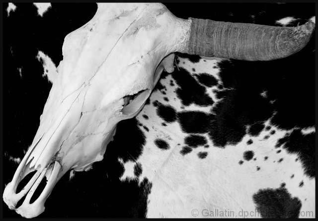
I do like the choice of black and white here. I think that it enhances the whole 'cow' theme.
Your focus and clarity are right on. Really nice crisp lines on the skull especially around the eyes, and nose area. It really shows up a lot of detail there.
I like how the skull rests mostly on the black area of the cloth. This is nice. This would be hilarious had it been shot against the body of a real cow...lol
Anyway, It appears as if you have cut the tip of the horn off to the right. Looks like another 5 pixels and you could have had the entire horn in the frame. I have to wonder why you did it this way. The rest of the framing/cropping looks fine to me. I like the angle at which this is taken, the angled skull really makes for something nice to look at, and having it to the left of the photo, with the horn poking over to the right is also very visually appealing.
Lighting looks great. The tonal range goes from nice white whites, to nice black blacks. Great use of black and white here.
Overall a really great shot. Congrats.
~Heather~ |
|
 Photographer found comment helpful. Photographer found comment helpful. |
|
|
06/02/2003 10:47:34 PM |
| what were the voters thinking? |
|
| Photographer found comment helpful. |
Comments Made During the Challenge  |
|
|
05/28/2003 11:00:22 PM |
| Well, at least steer parts. Good composition. Black and white was a good choice. |
|
| Photographer found comment helpful. |
|
|
05/27/2003 09:03:09 PM |
| you should be able to sell this one |
|
| Photographer found comment helpful. |
Home -
Challenges -
Community -
League -
Photos -
Cameras -
Lenses -
Learn -
Help -
Terms of Use -
Privacy -
Top ^
DPChallenge, and website content and design, Copyright © 2001-2026 Challenging Technologies, LLC.
All digital photo copyrights belong to the photographers and may not be used without permission.
Current Server Time: 02/01/2026 10:38:58 AM EST.