| Author | Thread |
|
|
09/18/2005 05:20:00 PM |
Greetings from the Critique Club
by strangeghost
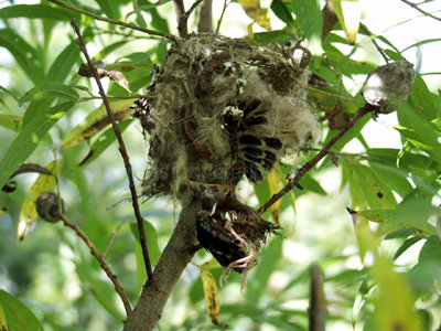
COMPOSITION
Like some of your commenters, I was not sure what I was looking at here. I generally don't read voter comments until I am done critiquing, but I couldn't resist. With the benefit of your photographer's comment, I believe this is a dead bird lodged in a tree branch. It is clear then, that the subject of your photo is not clear, something that will be punished severely in a challenge, and your final score of 4.0 certainly reflects this. It may not have been the best choice of subjects because it's really a mess of feathers and branches, but I understand your emotional reason for selecting it. Further, it's not helped any by the fact that the setting is fairly cluttered and complex with branches, leaves, and some sky. The result is a photo that is just hard to decipher and lacks visual appeal that might lead to detailed inspection. If that is the head on the right, I might have tried to zoom in on that area to isolate the one truly recognizable feature, and make that the subject of the comp. Also, try for compositions where the focus or subject is off-center, as with the rule of thirds.
TECHNIQUE
Some blown highlights in the sky result from your attempt to photograph a relatively dark, shaded subject with bright sky showing through. That's a tough job to do, even for the most skilled photographer with the best equipment. You could change your vantage point to look for an angle where there is not as much sky, or with the sun over your shoulder so your subject is better lit. Given a shot that has such blown highlights, some post-processing options can minimize or even mask them - creative use of curves or levels in Photoshop, or the Shadow/Highlight command available in PSCS and later. Your image also doesn't make use of the full 640 pixel dimensions available to you - another deadly sin in DPC-land. When resizing for web, make sure you use the full dimension and then use JPG compression to achieve the necessary <150K size limit.
OVERALL IMPACT
Not a shot with much viewer impact, and your score reflects this. Your comment indicates your own personal reason for choosing this subject, but you failed to communicate any of the emotion or passion to your viewers. As stated, this might have been impossible with this particular subject, but my hunch is you could have succeeded. Keep trying. Pay close attention to composition first, and utilize the tools at your disposal in post-processing to make the most of your shots. |
|
 Photographer found comment helpful. Photographer found comment helpful. |
Comments Made During the Challenge  |
|
|
09/13/2005 09:13:04 AM |
|
| Photographer found comment helpful. |
|
|
09/12/2005 03:52:39 PM |
| the things hanging out of the nest are really distracting and u cant even tell what they are... |
|
|
|
09/10/2005 11:41:47 AM |
| Meets challenge, but you need to ask yourself if this is really worth taking. Did not think the subject was. |
|
|
|
09/09/2005 07:00:34 PM |
| This has Slippy written all over it! ;-) Good focus and colors, although the blown out background highlights are a distraction. The image size is also a bit small. Still, have to give you props for uniqueness and creativity. :-) |
|
|
|
09/09/2005 07:12:01 AM |
| I can't tell what this is... |
|
|
|
09/08/2005 09:21:57 PM |
|
|
|
09/07/2005 04:05:23 PM |
| For me, had the main focus been off center, say in the lower left corner of the photo and cropped a bit tighter, I would have scored it higher. A most interesting subject. |
|
| Photographer found comment helpful. |
|
|
09/07/2005 03:31:59 PM |
| I see the branch, but thats it. I not sure whats going on here. Sorry maybe it's just me. Try focusing more on the subject next time. |
|
|
|
09/07/2005 02:39:57 PM |
| This is one of those pictures that would be awesome to see in person it just dont translate into a good photo. It is small too, not near as large as the rest of the photos in the challenge. |
|
| Photographer found comment helpful. |
|
|
09/07/2005 02:51:50 AM |
| the nest is not clear to me at all, nice idea |
|
|
|
09/06/2005 08:27:36 PM |
| What is this? The picture is too small to tell. |
|
Home -
Challenges -
Community -
League -
Photos -
Cameras -
Lenses -
Learn -
Help -
Terms of Use -
Privacy -
Top ^
DPChallenge, and website content and design, Copyright © 2001-2025 Challenging Technologies, LLC.
All digital photo copyrights belong to the photographers and may not be used without permission.
Current Server Time: 04/07/2025 02:37:04 PM EDT.