| Author | Thread |
|
|
09/17/2005 11:35:50 PM |
Hi from the Critique Club!
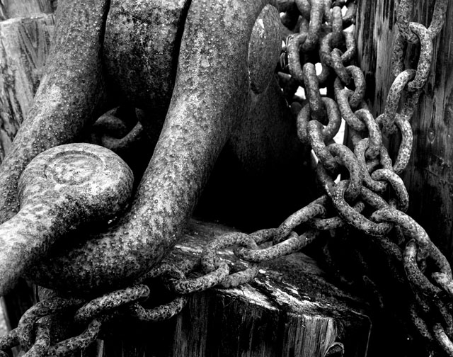
I totally understand what drew you to this. There are lovely rich textures in there, with the metal links contrasting with the texture of the wood.
The eye is led into the image by that round bolt(?) on the left and up to the top middle of the picture. It then follows the links down and out of the image at bottom left. The eye naturally, though, by-passes the area in the middle.
The focus seems a little soft on the links at top right - a smaller aperture would have overcome that.
The contrast here, although fine for a normal study, is not quite high enough for this challenge. Perhaps the lighting that day was a little flat? I would be very tempted to go back a re-shoot with different lighting conditions. Or perhaps try some post processing techniques - Channel mixer, dodging and burning, gradients..etc to try and draw out its full potential?
|
|
Comments Made During the Challenge  |
|
|
09/10/2005 01:36:07 AM |
| Great contrast, nice image. |
|
|
|
09/09/2005 10:42:28 PM |
| Really nice composition - I like the lines. Good contrast, but I think the prevalence of midrange tones cause it to lose some contrast. I'd be curious to see what it looked like in color. Don't get me wrong, there's plenty of good contrast here too, it's just that I think it might have even more in dark, rich, deep color tones. Still, solid entry. |
|
|
|
09/09/2005 07:29:28 PM |
Fit Challenge Criteria: 1/2
Color/Contrast: 1/2
Composition: 0/2
Photo Quality: 1/2
My Subjective Affinity: 0/2
I like the b/w on this photo. The focus seems a little soft, and even with the use of leading lines, I'm not really inclined to look deep in this photo. It just seems kind of plain. Don't know what the color version looked like, if there was colerful rust or not, but that, to me, would be more interesting. |
|
|
|
09/07/2005 06:13:09 AM |
| Could use even a little more contrast. Nice close-up...shows good detail. |
|
|
|
09/05/2005 07:45:45 PM |
| An interesting composition, but for me, the tonal ranges seem similar overall except for a few high contrast points along the links. |
|
|
|
09/05/2005 03:14:21 PM |
| Interesting shot. Good use of shadow. |
|
Home -
Challenges -
Community -
League -
Photos -
Cameras -
Lenses -
Learn -
Help -
Terms of Use -
Privacy -
Top ^
DPChallenge, and website content and design, Copyright © 2001-2026 Challenging Technologies, LLC.
All digital photo copyrights belong to the photographers and may not be used without permission.
Current Server Time: 02/01/2026 09:04:02 AM EST.