| Author | Thread |
|
|
09/14/2005 08:48:44 PM |
Greetings from the Critique Club!
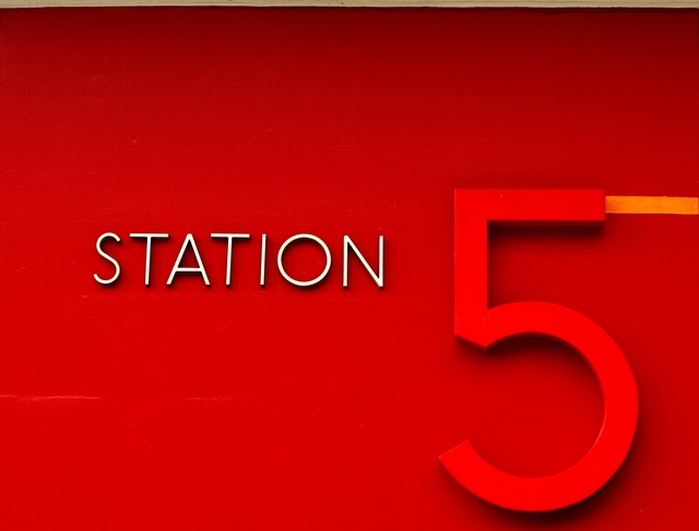
I didn't get a chance to vote in this challenge, life and all that but had I had the chance I probably would have given this image a 5 to start, possibly a 6.
I like the idea but the overpowering red in the shot overshadows any contrast the white STATION might have offered. Also the 5 itself seems a it out of focus, not sure if that was intentional, trying to keep the focus on the STATION but with it being such a large part of the image it's a bit distracting to me.
Also the orange line leading away from the top part of the 5, while a nice way to lead out of the shot doesn't really work for me, again it's competing against the STATION, and my attention is all over the place as a result.
Hope this help.
Deannda |
|
 Photographer found comment helpful. Photographer found comment helpful. |
Comments Made During the Challenge  |
|
|
09/11/2005 04:34:23 AM |
|
|
|
09/09/2005 06:03:43 PM |
| I like this very much. It's simple and graphic and certainly has high contrast. I wish the 5 were as sharp as the word station. |
|
| Photographer found comment helpful. |
|
|
09/09/2005 04:57:49 AM |
| Very nice with the reds. Really speaks "high contrast" to me. 10 |
|
| Photographer found comment helpful. |
|
|
09/08/2005 06:52:21 PM |
| You definintely have high contrast - wow! simply, yet works...wish that one line wasn't there in the middle left hand side, but again, good shot! |
|
| Photographer found comment helpful. |
|
|
09/08/2005 05:39:42 PM |
| This is really cool. Love the vivid color tones. My only minor criticism is that it's off horizontally (just a bit, but still noticeable). Otherwise, great entry. |
|
| Photographer found comment helpful. |
|
|
09/08/2005 05:02:35 AM |
| nice one, i really like it |
|
| Photographer found comment helpful. |
|
|
09/08/2005 02:29:17 AM |
| Cool idea. I like how the white really stands out. I think that this shot could maybe benefit from a tighter cropping. Especially at the top, the frame or bar, or whatever that line is across the top seems to really take a lot away from the image. |
|
| Photographer found comment helpful. |
|
|
09/07/2005 05:02:34 PM |
|
| Photographer found comment helpful. |
|
|
09/06/2005 01:57:05 AM |
|
| Photographer found comment helpful. |
|
|
09/05/2005 09:56:52 PM |
Great take on teh challenge, and with a PUNCH!
My only dig is the word station is off a little horizonatlly - kind messing with the balance. |
|
| Photographer found comment helpful. |
|
|
09/05/2005 06:24:56 AM |
|
Home -
Challenges -
Community -
League -
Photos -
Cameras -
Lenses -
Learn -
Help -
Terms of Use -
Privacy -
Top ^
DPChallenge, and website content and design, Copyright © 2001-2025 Challenging Technologies, LLC.
All digital photo copyrights belong to the photographers and may not be used without permission.
Current Server Time: 04/07/2025 02:43:40 PM EDT.