| Author | Thread |
|
|
09/17/2005 08:11:04 AM |
Hello and greetings from the Critique Club
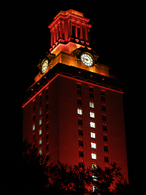
First, I have to admit that I know very little of UT and its traditions, this one included. I think there are some things in this shot that are well done and also some areas where some improvements could be made. Let's start with the good.
Without having seen the actual tower, I would have to say that the exposure here is right on, the image seems crisply focused and the colors are certainly vibrant and eye-catching. I also like how you have included some foreground elements to add depth and anchor the shot.
There are a few things that could be done to enhance this shot. The tower seems to be leaning to the left and that, combined with the perspective, give the sense that the building is falling over. Both are easily corrected in photo editing software.
As far as how this shot fits into the challenge, I would say it does just fine, there is certainly a high degree of contrast here.
I would venture to say that seeing this particular building illuminated this way is a lot more meaningful to someone familiar with the tradition. I don�t know anything about the buildings surrounding this one, but my feeling is that if you were to show the tower in context with its neighbors that are lit normally, it would have a wider appeal.
Keep up the good work!
|
|
 Photographer found comment helpful. Photographer found comment helpful. |
Comments Made During the Challenge  |
|
|
09/11/2005 06:31:18 PM |
| I like the contrast at the top of your photo. |
|
| Photographer found comment helpful. |
|
|
09/09/2005 09:26:07 PM |
| Cool shot, nice contrast created by the lighting. |
|
| Photographer found comment helpful. |
|
|
09/09/2005 02:16:49 PM |
| HOOK 'EM!!!!! Great tower shot from another fellow Longhorn!!! |
|
| Photographer found comment helpful. |
|
|
09/09/2005 05:05:14 AM |
|
| Photographer found comment helpful. |
|
|
09/08/2005 05:35:54 PM |
| Really incredible clarity for a night shot this far away. Love the color tones and focus. The angle seems a bit off to me though - not far enough off horizontal to be artistic and not close enough to horizontal to be straight. Know what I mean? Anyway, I still like the image and think it's a strong entry. |
|
| Photographer found comment helpful. |
|
|
09/06/2005 07:20:26 AM |
Which tradition exactly did it win?
I'm put off this pic for this challenge by the relatively small highlight area. Good pic with obvious high contrasts but ............... |
|
| Photographer found comment helpful. |
|
|
09/05/2005 10:00:54 AM |
|
| Photographer found comment helpful. |
|
|
09/05/2005 07:14:43 AM |
|
| Photographer found comment helpful. |
|
|
09/05/2005 06:09:52 AM |
| --could be in the university brocure... |
|
| Photographer found comment helpful. |
Home -
Challenges -
Community -
League -
Photos -
Cameras -
Lenses -
Learn -
Help -
Terms of Use -
Privacy -
Top ^
DPChallenge, and website content and design, Copyright © 2001-2025 Challenging Technologies, LLC.
All digital photo copyrights belong to the photographers and may not be used without permission.
Current Server Time: 04/07/2025 02:01:05 AM EDT.