| Photograph Information |
Photographer's Comments |
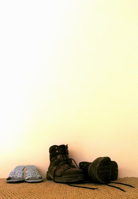
Challenge: Shoes (Basic Editing III)
Camera: Canon PowerShot S50
Location: Living room
Date: Aug 30, 2005
Aperture: 5.0
ISO: 50
Shutter: 2 damn seconds
Galleries: Fashion, Interior
Date Uploaded: Aug 30, 2005
|
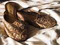
My boots and my girlfriends...pumps? I don't know what shoes like this are called. They look good on her, that's all that matters (well, that and comfort, you know). This was my first and last idea, but I shot it from a whole mess of different angles to get what I wanted. This angle was the last one I chose. The processing was the last way I chose to process, which by the way, was pretty simple. Levels on RGB, R, G, and B, some curves, some USM, and finally some Neat Image (it's pretty noisy, especially full size...yikes!)
Hey, it's in color, so I hope it does well...I need some color on my profile page. |
| Author | Thread |
Comments Made During the Challenge  |
|
|
09/06/2005 11:47:05 AM |
|
 Photographer found comment helpful. Photographer found comment helpful. |
|
|
09/05/2005 09:02:44 AM |
| If I hadn't scrolled my screen down, I'd almost missed it! :-) Great pic! |
|
| Photographer found comment helpful. |
|
|
09/04/2005 05:46:03 PM |
I like the open and airyness of this picture. I also like that you placed the large boots more in the center of the image, to help balance out the sandals.
|
|
| Photographer found comment helpful. |
|
|
09/02/2005 12:54:53 PM |
|
| Photographer found comment helpful. |
|
|
09/02/2005 11:16:08 AM |
|
| Photographer found comment helpful. |
|
|
09/01/2005 05:40:03 PM |
| Way too much light area on the top. A wide, skinny crop would have worked better. The tones are good. |
|
| Photographer found comment helpful. |
|
|
09/01/2005 01:44:03 PM |
|
| Photographer found comment helpful. |
|
|
09/01/2005 05:25:11 AM |
| Beautiful background, nice texture. The shoes are a little off-center, but it's balenced, so it's not bad. Great job on the lighting; the shadows are perfect. |
|
| Photographer found comment helpful. |
|
|
08/31/2005 10:58:53 PM |
|
| Photographer found comment helpful. |
|
|
08/31/2005 06:09:21 PM |
| too much empty black space, less wall and carpet, more shoe |
|
| Photographer found comment helpful. |
|
|
08/31/2005 04:27:36 PM |
| I like the background amd how the wall seems to change color as you go up it. But I don't like how you used your space and there is alot more space that you could have used. |
|
| Photographer found comment helpful. |
|
|
08/31/2005 04:04:01 PM |
| to me the background of the wall is way to dominant in this photo. Its also very bright and a bit disracting. The glow that the shoes give off is nice. i would have cropped the wall way down. |
|
| Photographer found comment helpful. |
|
|
08/31/2005 03:27:06 PM |
| i like the composition, would like to see more sharpness/detail in the darker tones. |
|
| Photographer found comment helpful. |
|
|
08/30/2005 09:26:50 PM |
| OMG, fantastic .. the wall is brilliant, the composition is stunning with so muh walll dwarfing the shoes. The point poachers for me are the slippers (loose 'em) and the horizon (without a grid on it, i'd swear is is left hand down a bit) |
|
| Photographer found comment helpful. |
Home -
Challenges -
Community -
League -
Photos -
Cameras -
Lenses -
Learn -
Help -
Terms of Use -
Privacy -
Top ^
DPChallenge, and website content and design, Copyright © 2001-2025 Challenging Technologies, LLC.
All digital photo copyrights belong to the photographers and may not be used without permission.
Current Server Time: 04/08/2025 03:24:16 AM EDT.