| Author | Thread |
Comments Made During the Challenge  |
|
|
09/11/2005 03:11:45 PM |
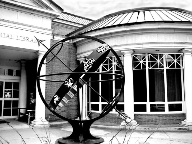
| Good contrast areas, but busy photo with the round lines of the sculpture against the lines of the building itself - at least to me. |
|
|
|
09/11/2005 08:33:43 AM |
| Good contrast, but a bit too much detail for my taste. Maybe just the sphere shot against the sky would have yielded a clearer, easier to digest, image? |
|
|
|
09/09/2005 09:42:51 PM |
| Very awesome shot, the contrast is wonderful. |
|
|
|
09/08/2005 06:26:32 AM |
| I like the clouds in this shot. It seems like a very inviting place. God job. |
|
|
|
09/07/2005 09:49:08 PM |
| I feel like this shot was in a previous challenge...6 |
|
|
|
09/07/2005 04:34:12 PM |
| If you could have blurred the background to make the subject stand out more it would have helped a lot. |
|
|
|
09/05/2005 08:02:46 AM |
| Really like how the astrological signs almost glow on the sculpture. Nice contrasting tones. |
|
|
|
09/05/2005 06:19:45 AM |
| nice contrast. perhaps you could have found an angle that included the full library name or removed it all together. Your zodiac signs appear way, way over-sharpened to me. I think a nice overall "sharpen edges" in photoshop would have sufficed |
|
|
|
09/04/2005 08:47:38 PM |
| Those twigs in the forground are rather distracting. Nice use of contrast though in the tones. The composition could do with a bit of a re-vamp, getting verticals parallel and the foreground and background elements are confusing right now. Maybe a lower point of view would have enhanced it? |
|
Home -
Challenges -
Community -
League -
Photos -
Cameras -
Lenses -
Learn -
Help -
Terms of Use -
Privacy -
Top ^
DPChallenge, and website content and design, Copyright © 2001-2025 Challenging Technologies, LLC.
All digital photo copyrights belong to the photographers and may not be used without permission.
Current Server Time: 04/08/2025 01:37:49 AM EDT.