| Author | Thread |
Comments Made During the Challenge  |
|
|
06/16/2002 11:28:00 PM |
|
|
|
06/15/2002 02:33:00 PM |
|
|
|
06/14/2002 04:03:00 PM |
|
|
|
06/14/2002 04:42:00 AM |
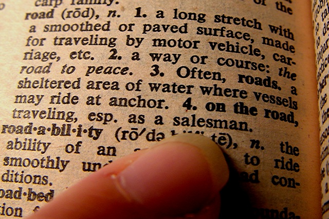
| Very interesting interpretation. The photo is nice, high contrast (which I like) but not very compelling for me. |
|
|
|
06/13/2002 12:40:00 PM |
|
|
|
06/13/2002 02:06:00 AM |
You wouldn't be trying to sell me this photo would you?
BTW -- thanks -- I'd heard #3 used but never seen the dictionary explanation... |
|
|
|
06/12/2002 11:56:00 PM |
| Creative interpretation of the theme. :-) |
|
|
|
06/12/2002 01:15:00 PM |
|
|
|
06/11/2002 08:47:00 PM |
| Nice picture of a dictionary??? |
|
|
|
06/11/2002 06:07:00 PM |
| Beautifully done photo - stretching the challenge (heavily!!! really) You are getting alot of text bleed from the print on the opposite side of the page, I think if you insert a blank, black piece of paper, it would help. Am I seeing extra red tint? Lighting - washed out page on the left, strong red color on the right. Photo (would I want this on my wall, no) 4 Creativity 10 (with the stretch) Road (my turn for interpretation) 0 (see you can achieve less than 1 point! a new site record) total 4 (takes your chances.....) |
|
|
|
06/11/2002 04:51:00 PM |
| Good sharp, focus. I can't decide if it is a literal interpretation of the challenge or a stretched one. :-). |
|
|
|
06/11/2002 12:34:00 PM |
|
|
|
06/11/2002 11:22:00 AM |
|
|
|
06/11/2002 09:52:00 AM |
| Great focus, and an original idea. I like the lighting and the color. |
|
|
|
06/11/2002 12:24:00 AM |
| creativety 6 interesting 4 focus 9 framing 7=6 |
|
|
|
06/10/2002 10:46:00 PM |
| Great use of your imagination! I like it because it is different and stands out. |
|
|
|
06/10/2002 10:11:00 PM |
| Interesting solution to the challange. I'll bet you're getting some flack from those who get upset if they don't see asphalt:) Well done macro work. |
|
|
|
06/10/2002 07:51:00 PM |
| Not a bad idea... well done too. |
|
|
|
06/10/2002 04:01:00 PM |
| Too cute, you clever person!! Fun shot, done well. |
|
|
|
06/10/2002 02:16:00 PM |
nice idea
needs better lighting on the focal point |
|
|
|
06/10/2002 02:04:00 PM |
| Very creative. Boy do i bet you get hammered by these sheep who think the endless obvious cliche is the only answer to a challenge. |
|
|
|
06/10/2002 12:11:00 PM |
|
|
|
06/10/2002 11:24:00 AM |
| haha.. good interpretation. I might be off base here, but play with the white balance and see if you can get this a little brighter. Other than that, I like it. |
|
|
|
06/10/2002 11:22:00 AM |
| This is a well-executed photograph... a little extra white balance or level adjustment would have possibly brightened up the page of the dictionary just a bit more... My overall problem with this particular shot is that it is outside my idea of the challenge topic. It *is* on topic but it does not appeal to me as a great interpretation of this challenge... |
|
|
|
06/10/2002 10:20:00 AM |
| Interesting to see all the different interpretations. This one is clever. |
|
|
|
06/10/2002 10:12:00 AM |
| No offense to the finger, but if its gonna be part of a photo, have a manicure. Besides the finger I like the photo. It seems a bit bright on the left but not too bad. Texture and color of the paper give it character. |
|
|
|
06/10/2002 09:04:00 AM |
|
|
|
06/10/2002 04:19:00 AM |
| Interesting interpetation. |
|
|
|
06/10/2002 03:37:00 AM |
|
Home -
Challenges -
Community -
League -
Photos -
Cameras -
Lenses -
Learn -
Help -
Terms of Use -
Privacy -
Top ^
DPChallenge, and website content and design, Copyright © 2001-2026 Challenging Technologies, LLC.
All digital photo copyrights belong to the photographers and may not be used without permission.
Current Server Time: 02/01/2026 11:04:46 AM EST.