| Author | Thread |
|
|
09/20/2005 07:28:47 PM |
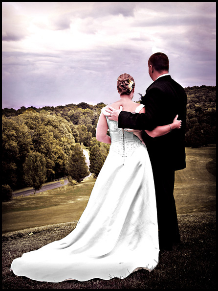
| This is a wonderful shot. It looks like something that you might have seen in a magazine even many years ago...classic look. I like the editing that has been done here, but it would also be interesting to see this in a more natural look. I'll be the bride and groom really liked it. Very artistic and lovely. |
|
 Photographer found comment helpful. Photographer found comment helpful. |
|
|
09/05/2005 04:16:22 AM |
Originally posted by mavrik:
voted down for having people's names in the title when the challenge was about DREW AND LANGDON! lol
That kills me. |
You should know better than that lol
I guess everyone has different opinions but I don't understand why people said it looks over processed. Like yes, it obviously has been edited, but you can tell that its 100% intentional. In my opinion it actually adds to the photo. I think wedding photos do require a different set of editing rules to other photos whcih is why I perhaps like it. I guess the colours remind me of something from my parents wedding album, very classic. |
|
| Photographer found comment helpful. |
|
|
09/04/2005 08:07:13 PM |
voted down for having people's names in the title when the challenge was about DREW AND LANGDON! lol
That kills me. |
|
Comments Made During the Challenge  |
|
|
09/04/2005 07:52:01 PM |
| Their faces are a little jagged from oversharpening I think, but I love the sentiment and the title. Excellent. |
|
| Photographer found comment helpful. |
|
|
09/03/2005 10:18:23 PM |
| nice, I love the slight purple tint here |
|
| Photographer found comment helpful. |
|
|
09/03/2005 08:17:45 AM |
It's hard to tell from behind but this looks like a photo of Pete and Darcy to me.
I could be wrong? |
|
| Photographer found comment helpful. |
|
|
09/03/2005 04:42:34 AM |
| Is dan the one on the left or right? Nicely composed. |
|
| Photographer found comment helpful. |
|
|
09/01/2005 10:09:32 AM |
something seems off and the coloring
|
|
| Photographer found comment helpful. |
|
|
08/31/2005 07:20:10 PM |
| good composition, I think the shot in it self is good. The over all color, contrast of the image looks flat, no pop to it........imo 4.......since we don't have a 4.5 |
|
| Photographer found comment helpful. |
|
|
08/31/2005 02:00:08 PM |
| The only thing linking the photo to the challenge is the title, and we have to take your word for it that these models are infact D&L. |
|
|
|
08/30/2005 07:32:19 PM |
| This has been my favorite interpretation of the challenge. I alway prefer bright, brilliant colors but the softer tones work nicely here as well. |
|
| Photographer found comment helpful. |
|
|
08/29/2005 10:22:42 PM |
| This shot looks over-processed. Something about the way that the wedding dress is draped makes this feel off-balance; perhaps if there was something filling the large negative space on the top left (a church steeple, for example) it would work better. |
|
| Photographer found comment helpful. |
|
|
08/29/2005 06:36:00 PM |
| Lighting seems a little odd here. Kind of washed out. |
|
| Photographer found comment helpful. |
|
|
08/29/2005 02:57:10 PM |
| beautifully weird colors! a top shot. |
|
| Photographer found comment helpful. |
|
|
08/29/2005 02:37:25 PM |
| Great capture! Would be better with a more natrual color tone, their skin looks a bit purple |
|
| Photographer found comment helpful. |
|
|
08/28/2005 08:55:27 PM |
| Congrats to the happy couple. Interesting use of coloration. Nicely composed. |
|
| Photographer found comment helpful. |
Home -
Challenges -
Community -
League -
Photos -
Cameras -
Lenses -
Learn -
Help -
Terms of Use -
Privacy -
Top ^
DPChallenge, and website content and design, Copyright © 2001-2025 Challenging Technologies, LLC.
All digital photo copyrights belong to the photographers and may not be used without permission.
Current Server Time: 04/08/2025 01:34:34 AM EDT.