| Author | Thread |
|
|
09/12/2005 02:06:24 PM |
Greetings from the Critique Club!
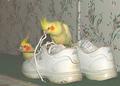
The initial thing that catches the eye is the blurry focus. There is an overabundance of shoes lay out like a starburst. The combination of the two is not a winning recipe. You need a clear shot as well as an interesting placement in order for several items in a shot to be interesting to the eye. What if you had them tumbling down a solid incline? What if you had one of the boots in a funning setting, paying homage to it's "kingliness?" Sitting in front of a door on carpet, it just has the appearance of quick slipshod snapshot taken in haste without alot of forethought. Once you get that basic shot, then the rest is working with curves, contrast and color, depending on whether you are using full color or black and white (or sepia, etc)to tweak all of the nuances of the photo. But it all starts with the basic image. The rest is just the difference between a good shot and a GREAT one.
As a member of DPC, you'll learn from comments such as these as well as viewing others' work. I still find it inspiring and strive for a better photograph every time! All the best, Judy
|
|
Comments Made During the Challenge  |
|
|
09/05/2005 02:58:24 PM |
| I don't get it. The lighting is funky and the photo is kinda blurred. |
|
|
|
09/04/2005 08:25:17 PM |
Fit Challenge Criteria: 2/2
Contrast/Color: 0/2
Composition: 0/2
Photo Quality: 0/2
My Subjective Affinity: 0/2 |
|
|
|
09/04/2005 04:07:30 PM |
| Nice idea. The shoes seem a bit fuzzy though. |
|
|
|
09/04/2005 07:49:36 AM |
For future referance, your white balance is off in this photo. On your camra white balance will be marked as WB on a button or menu option. For house lights it needs to be set to tungsten to disaperate this yellow tinge.
As a static image, the focus should have been sharper.
Also be aware of your background. If you had moved the shoes over just a little the image would have been spared that dark distracting crack leading into the wardrobe. |
|
|
|
08/31/2005 05:07:39 PM |
| A little fuzzy, lighting was too yellow. Funny subject, though. |
|
|
|
08/31/2005 04:31:29 PM |
| A little to blury and I can see the dots in the photo. Maybe next time a little more sitll. I love the lighting!!!!!!! |
|
|
|
08/31/2005 02:09:52 PM |
|
|
|
08/31/2005 12:34:47 PM |
| funny - photo could use some work. but funny. |
|
|
|
08/31/2005 12:17:09 PM |
| Seems slightly out of focus. |
|
|
|
08/31/2005 11:48:13 AM |
|
|
|
08/31/2005 11:21:45 AM |
|
|
|
08/31/2005 07:51:20 AM |
| Cute concept, woefully out of focus. |
|
|
|
08/31/2005 03:42:30 AM |
| Doesn't look like anything is in focus. |
|
|
|
08/31/2005 02:22:30 AM |
| Poor lighting - Artificial light has not helped with the colours here... |
|
Home -
Challenges -
Community -
League -
Photos -
Cameras -
Lenses -
Learn -
Help -
Terms of Use -
Privacy -
Top ^
DPChallenge, and website content and design, Copyright © 2001-2025 Challenging Technologies, LLC.
All digital photo copyrights belong to the photographers and may not be used without permission.
Current Server Time: 04/09/2025 03:11:45 PM EDT.