| Author | Thread |
|
|
06/01/2003 06:39:34 PM |
Hi from the Critique Club, Greg!
I hope I can offer you some useful comments on your matrix entry.
Colour, Composition, Contrast:
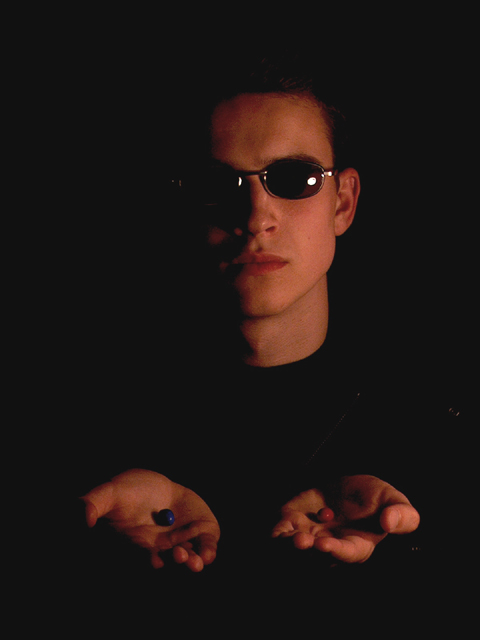
You were in tough company with the number of red/blue pill shots, but yours was one of the more bold compositions because you included a person in it.
The skin tones here seem a bit red, perhaps due to underexposure? I'll touch on lighting below, but here I will say that I like the placement of your subject and the hands open with a pill in each palm. I wish the pills were more visible, however, as they seem to get lose in the shape of the forward hand, maybe if they were tipped downward just a little more to better present the pills to the viewer? I like the mood created by your composition, however. I would not alter it too much. :)
Focus and lighting:
Here is where I think your shot could have benefitted from a little more work. Its a bit dark, though I really like that one side of your subject is fading into the black. I would have preferred a little more light on the lit side. I like the reflections on the glasses too though, it adds some interest to the face.
Overall:
This is a good shot that only needed a bit more lighting to bring out the expression of the shot! :)
Happy shooting, and keep submitting! |
|
 Photographer found comment helpful. Photographer found comment helpful. |
Comments Made During the Challenge  |
|
|
05/27/2003 05:56:09 PM |
| Looove the composition of this one. Wish the lighting on the pills was a bit better. Still, good job. 7 =-) |
|
| Photographer found comment helpful. |
|
|
05/27/2003 10:18:49 AM |
| nice high contrast image, i like how the subjects body dissappears into the black background, good work 5 |
|
| Photographer found comment helpful. |
|
|
05/26/2003 10:41:09 PM |
| whoa. IMO this really needs some black level adjustment to make the background black instead of grey. it's a nice use of light and dark tho. fits the challenge well. |
|
| Photographer found comment helpful. |
|
|
05/25/2003 07:15:27 PM |
| Good image, good portrait in relation to the challenge. It might have been cool if you could have put just a bit more light on the hands to clearly show the red and blue pill significance but keeping the light on the face just as is. Overall i like the darkness and, much to my own loss in a prior submission, i do like dark images :) 8 |
|
| Photographer found comment helpful. |
|
|
05/24/2003 05:56:54 PM |
| Nice lighting, just underexposed. |
|
| Photographer found comment helpful. |
|
|
05/23/2003 01:34:01 AM |
|
|
|
05/22/2003 07:37:48 AM |
| The half shadow on the face is good, adds a nice mood, although the slight shine of the glass rim on the left appears in the shadow making it detached and thus distracting. I probably would have liked the shadow to be more centered down the face, or at least as far as removing the light flare on the left glass lens. In contrast, I think the hands and the pills needed more light. They are a little too dark and so do not stand out as well as they should seeing as they are the main focus - the choice. The mood is good, the composition is fine, I just feel the lighting could really bring out the best in the image. |
|
| Photographer found comment helpful. |
|
|
05/21/2003 10:03:42 PM |
| Good picture, nice lighting effect. I can't help but think that it's a little too dark on the left side of his face though. No matter, I still rated it high cause it's just good. :) |
|
| Photographer found comment helpful. |
|
|
05/20/2003 08:32:47 PM |
| good lighting, altough I wish the catchlights on the glasses were even |
|
| Photographer found comment helpful. |
Home -
Challenges -
Community -
League -
Photos -
Cameras -
Lenses -
Learn -
Help -
Terms of Use -
Privacy -
Top ^
DPChallenge, and website content and design, Copyright © 2001-2025 Challenging Technologies, LLC.
All digital photo copyrights belong to the photographers and may not be used without permission.
Current Server Time: 04/07/2025 12:19:38 AM EDT.