| Author | Thread |
|
|
08/29/2005 07:56:40 AM |
| I scored this one very high |
|
 Photographer found comment helpful. Photographer found comment helpful. |
Comments Made During the Challenge  |
|
|
08/28/2005 07:53:12 PM |
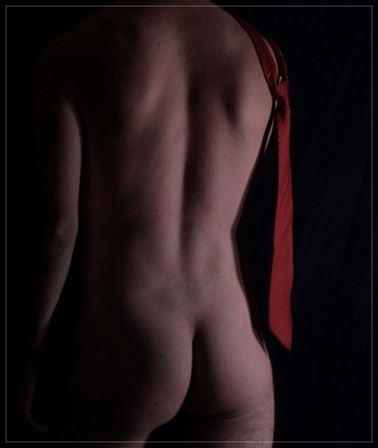
| Nice tie (tee hee). Seriously though, I like it, but on my monitor the skin tone seems a bit too red (but it could be my screen). |
|
| Photographer found comment helpful. |
|
|
08/28/2005 04:36:45 PM |
| Nice angle on the lighting. I wish there was just a little more definition on the tie. |
|
| Photographer found comment helpful. |
|
|
08/28/2005 02:55:50 PM |
| A tad dark and the focus is just a little soft. The lighting works well in bringing out the back but the arm looks like it is just hanging in mid-air. |
|
| Photographer found comment helpful. |
|
|
08/26/2005 11:05:50 PM |
| A bit flat. The left arm and right ... red thing(?) distract from the interesting curves and shadows on the models back. |
|
| Photographer found comment helpful. |
|
|
08/24/2005 10:39:23 PM |
| Excellent topic, and great shot. It's a slight big dark, and there's some wierd lighting on the right leg distracting me. I think with a bit more exposure, it could have been brought up a couple points. |
|
| Photographer found comment helpful. |
|
|
08/24/2005 11:51:14 AM |
| The red contrasts well with the form and I like the shadow along his side. The lighting gives good modeling to his shape. The color looks dull or muddy and the focus seems to be off. Overall I think you did a good job if this is a self portrait. I find it's very hard to get good focus on self portraits. |
|
| Photographer found comment helpful. |
|
|
08/24/2005 01:59:41 AM |
| I like the use of shadows and the red tie helps add just the right touch of color. |
|
| Photographer found comment helpful. |
|
|
08/23/2005 09:40:02 PM |
| I like the pose, it is enhanced by your use of lighting. It seems the model is a little dark, perhaps jump up the brightness a little. Upped brightness may also bring out the tie a little more. Nice crop, and I like the border on this shot. Good job. |
|
| Photographer found comment helpful. |
|
|
08/23/2005 06:02:48 PM |
| Idea is nice, but i find the lighting too soft and not strong enought. The frame is interesting (overlay) but doesn't give much to the picture, yet a suspect no frame would not be as good looking. Small details like the left hand, or the tie's tip's shadow on the cheek makes this light study less then perfect. 6 |
|
| Photographer found comment helpful. |
|
|
08/23/2005 01:38:29 PM |
| Now THAT is a nice male torso! |
|
| Photographer found comment helpful. |
|
|
08/23/2005 01:06:43 PM |
Also nice. Missing a bit of POP though. I can't find any major faults in the image, but at the same time it doesn't hit me as a photo I want on my wall.
Maybe a bit more contrast & brightness would work.
Or a desaturation except for the red tie. |
|
| Photographer found comment helpful. |
|
|
08/23/2005 06:05:21 AM |
| great idea, can improve sharpness. |
|
| Photographer found comment helpful. |
|
|
08/22/2005 11:49:26 PM |
| Well done technically, but boring compositionally. 6. |
|
| Photographer found comment helpful. |
|
|
08/22/2005 11:37:20 PM |
| i wanna work at your work if beuing in the nud is powerful! Good lighting and compostion - i think your tie was swinging... |
|
| Photographer found comment helpful. |
|
|
08/22/2005 09:28:07 PM |
| Funny picture. I like the idea. I like the lighting, although I feel the photo overall is a tad too dark. I wish you the best of luck. |
|
| Photographer found comment helpful. |
|
|
08/22/2005 09:26:54 PM |
| Simple and elegant. I like it. 8 |
|
| Photographer found comment helpful. |
|
|
08/22/2005 06:33:13 PM |
| Could do with out the border,7 |
|
| Photographer found comment helpful. |
|
|
08/22/2005 05:11:31 PM |
| The colors are off and the lighting could be better. The background is too obvious and wrinkled. |
|
| Photographer found comment helpful. |
|
|
08/22/2005 04:09:43 PM |
| I like the pose, I like the tie, and the skin tones are very nice. Wish the overall pic weren't quite so dark, tho. |
|
| Photographer found comment helpful. |
|
|
08/22/2005 03:06:28 PM |
| The added tie makes the image in my opinion. The tones are a little dark. the lighting works but would look better with some lighter tones. Composition and crop okay. POV well done. 6 - good luck in the challenge! |
|
| Photographer found comment helpful. |
|
|
08/22/2005 02:44:18 PM |
|
| Photographer found comment helpful. |
|
|
08/22/2005 10:27:23 AM |
| Good idea. I wish it wasn't so dark. |
|
| Photographer found comment helpful. |
|
|
08/22/2005 02:52:11 AM |
| Good use of lighting. Creative title. Good luck. |
|
| Photographer found comment helpful. |
|
|
08/22/2005 12:59:23 AM |
| Nice shadowing.. The tie makes the suit now doesn't it???? |
|
| Photographer found comment helpful. |
|
|
08/22/2005 12:21:53 AM |
| i feel the composition could have been improved also maybe the tie could have been more prominent or the lighting a bit stronger... i guess i just dont think the subtle tone works well with this image. |
|
| Photographer found comment helpful. |
Home -
Challenges -
Community -
League -
Photos -
Cameras -
Lenses -
Learn -
Help -
Terms of Use -
Privacy -
Top ^
DPChallenge, and website content and design, Copyright © 2001-2026 Challenging Technologies, LLC.
All digital photo copyrights belong to the photographers and may not be used without permission.
Current Server Time: 02/01/2026 09:25:21 AM EST.