| Author | Thread |
|
|
08/19/2005 05:51:11 PM |
| Oh wow - this is so much more natural looking! I love it as it :) |
|
 Photographer found comment helpful. Photographer found comment helpful. |
|
|
08/19/2005 03:35:48 PM |
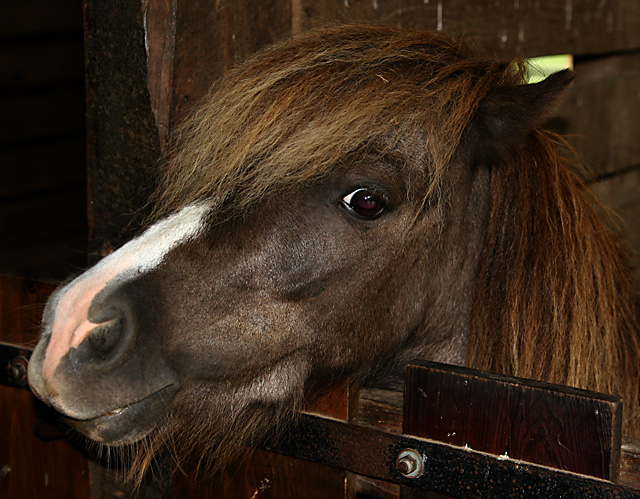
You've started with a well exposed photo SOOTC. That's a great start. Clearly your second attempt is much improved over the first one. for all the reasons stated inthe comments. One of the things about the second attempt is that you have used your tools with a lighter touch. I like to think of these tools a little bit like cod liver oil. A little may be good, but often more than a little produces unintended consequences!
Nice job onthe second edit especially! |
|
| Photographer found comment helpful. |
|
|
08/19/2005 02:07:41 AM |
Yup, nice improvement but i still prefer the original crop. Nose here is much much better. The splodge of green behind his head still detracts for me in the way the original crop doesn't. I think it's because I understand what it is in the wider crop but here it's a bit confusing.
You've made life hard for yourself here by taking a brown horse against a brown stable wall so he will tend to merge into the background.
Take him outside next time or paint the stable white
;-)
Steve
|
|
| Photographer found comment helpful. |
|
|
08/18/2005 09:00:10 PM |
| wow! very nice. Nice to see the details in the nose now. Not much for me to add at this point. Maybe clone out the patch of green by it's ear? On second thought, never mind, it's fine as is |
|
| Photographer found comment helpful. |
|
|
08/18/2005 05:44:27 PM |
| Following good previous comments is hard :) I do agree that this photo is the best of all three. I like the new crop and the image is not too sharp now. I'm myself learning to play with dodge and durn (I know it works better in B&W) but I wonder if the slightest of dodging might help as well? Maybe a 2-3% on some parts of his mane and his skin to bring out highlights? Maybe you could also burn a bit of the stall to make it fade in the background? Outside of those minor details, well done!!! |
|
| Photographer found comment helpful. |
|
|
08/18/2005 05:28:10 PM |
| LOVE LOVE LOVE this. I have a great appreciation for horses although I hardly know anything about them. This guy's face is so expressive. I just think you captured his essence. Great shot. |
|
| Photographer found comment helpful. |
|
|
08/18/2005 05:10:11 PM |
| Much better looking, the best of the three, I think. He (she?) looks cheerful. My only complaint is that now the scene seems a little dark. Do you have a Selective Color adjustment in whatever you're using? Try pulling some black out of the red and yellow channels to lighten up the browns without blowing the whites. |
|
| Photographer found comment helpful. |
Home -
Challenges -
Community -
League -
Photos -
Cameras -
Lenses -
Learn -
Help -
Terms of Use -
Privacy -
Top ^
DPChallenge, and website content and design, Copyright © 2001-2025 Challenging Technologies, LLC.
All digital photo copyrights belong to the photographers and may not be used without permission.
Current Server Time: 04/07/2025 02:43:58 PM EDT.