| Author | Thread |
|
|
05/29/2003 11:11:44 AM |
Greetings from the Critique Club!...
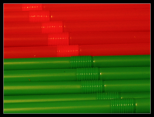
COMPOSITION... Overall, the photo lacks a bit of that elusive "wow" factor that the winning images have. The composition is strong however, by having a very simple, uncluttered subject, strong lines, and repeating patterns. I like the break in the diagnonal pattern - the foldable parts of the straws are not perfectly aligned but symettrical - upsetting the balance of the shot. Adds a bit of interest.
TECHNICAL ... There is a slight overall feeling of unsharpness and undexposure.. run unsharp mask and see if it helps the sharpness issue. Use a level adjustment to correct for any exposure problems. Whenever I do a critique at a computer other than my own, it could be possible that the uncalibrated monitor gives me a very wrong impression of color in an image... but when you do a levels adjustment, you will see from the histogram if there are any problems that need fixing.
OVERALL... My overall impression is that the photo is a great underlying backdrop for something else ... some small element is missing to give the photo that extra "edge". Stands enough stronly on its own though and its an interesting abstract. |
|
Comments Made During the Challenge  |
|
|
05/24/2003 07:47:15 PM |
| Engaging and ineresting patterns make this work well. |
|
|
|
05/22/2003 04:05:44 PM |
Ow, my eyes.
Okay, let's try that again. Yes, yes that would fit the topic quite well. And they're BENDY straws, which is not something I would have ever thought to photograph myself. Very bright, very intense. I think I kinda like it. |
|
|
|
05/22/2003 01:08:27 PM |
| Reminded me of red and green earthworms. Good composition. Lining up the bendable area gives a line for the eyes to follow. |
|
|
|
05/20/2003 03:31:00 AM |
| I like the idea but feel it would work better if the straws were parallel to the photo frame. |
|
|
|
05/20/2003 02:18:33 AM |
| I think the dirty green straw (second green down) spoils what would otherwise have been a nice effect. |
|
|
|
05/20/2003 01:35:30 AM |
| There are some spots and dirt on the straws that don't complement them |
|
|
|
05/19/2003 05:16:01 PM |
| The reds seem to run together at the top, Some shadow up there would help. |
|
|
|
05/19/2003 03:00:55 PM |
| meets the challenge, and the diagonal adds some interest to the horizontal lnes. The lighting is really dark/ flat though and doesn't add much. Strong backlight if these straws were translucent might have made this pop |
|
|
|
05/19/2003 11:21:23 AM |
| Everyone loves a good bendy straw. Perhaps alternating the colors would have given you at lesat one red one with sharp focus. |
|
|
|
05/18/2003 08:15:19 PM |
| complementary colors for sure.... subjectively, a bit uninteresting to me personally. some of the straws appear to have dirt specs on them and the alignment doesn't seem to work well, especially on the green ones... = 4 |
|
Home -
Challenges -
Community -
League -
Photos -
Cameras -
Lenses -
Learn -
Help -
Terms of Use -
Privacy -
Top ^
DPChallenge, and website content and design, Copyright © 2001-2025 Challenging Technologies, LLC.
All digital photo copyrights belong to the photographers and may not be used without permission.
Current Server Time: 04/07/2025 01:06:04 PM EDT.