| Author | Thread |
|
|
09/16/2005 10:01:28 AM |
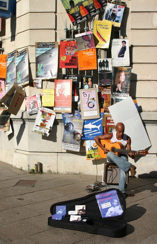
| I'm not sure that I agree with the tighter crop perspective. I think that the enormity of the adverts plastered all over the wall really illuminate the smallness and relative inconsequential nature of the lone, struggling guitarist. I do agree that it's a lot of information and color for the viewer to take in. Have you considered a selective desat to show the musician and his "wares" in full color and perhaps a muted tonal version of the signs and B/W for everything else? Or perhaps just a few of the signs in color? Just a thought... My thinking was that 1) you wouldn't need to crop the shot and lessen the impact of the musician's plight, 2) you could bring the viewer's focus back to the musician, and 3) you could "highlight" (but not overwhelm) the competition. Just my 2 cents on a good shot as is. :-) |
|
 Photographer found comment helpful. Photographer found comment helpful. |
|
|
08/27/2005 12:39:39 PM |
| I think a tighter crop is definitely in order for this picture, especially that blue sign in the top left corner. Perhaps you could have gotten a better shot if you were lower to the ground, more level with his guitar case? |
|
| Photographer found comment helpful. |
|
|
08/17/2005 01:20:56 PM |
| I think it would have been stronger with less sidewalk and building, just the case, the guitarist and the posters. still a strong shot of a struggling player juxtaposed with tho ads for those who have made the big time. |
|
| Photographer found comment helpful. |
|
|
08/17/2005 01:16:45 AM |
I like it, but the musician is probably a bit lost in the background for the challenge voters.
Chris |
|
| Photographer found comment helpful. |
Home -
Challenges -
Community -
League -
Photos -
Cameras -
Lenses -
Learn -
Help -
Terms of Use -
Privacy -
Top ^
DPChallenge, and website content and design, Copyright © 2001-2025 Challenging Technologies, LLC.
All digital photo copyrights belong to the photographers and may not be used without permission.
Current Server Time: 04/08/2025 04:58:18 AM EDT.