| Author | Thread |
|
|
06/02/2003 07:12:32 PM |
hey there from the CC Club ...
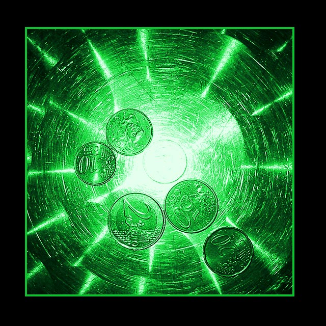
ahh the matrix ... what a fun challenge and opportunity for interpretations .. this is an interesting image .. the colors of green and black work well together and the detail and composition plays with my eyes at least .. i think the square crop with the circle on the inside works nicely and draws the eye to the center, although i'm not quite sure that the layout of the coins works along with the circular pattern you've created with the green shiny background ... if they were in in a circle as well i think maybe it would help the composition. over all though this is a pretty cool shot ... what is that in the background? i want to think it's a Compact Disc or something but i dont think it is... very creative idea :)
keep up the great work. |
|
Comments Made During the Challenge  |
|
|
05/25/2003 10:27:29 PM |
| Find your title slightly klutzy but your image is very creative What's the background, a CD? Very nice color green, nice 'motion' effect. And that big black border works very well! 8 |
|
 Photographer found comment helpful. Photographer found comment helpful. |
|
|
05/25/2003 01:51:19 AM |
| I like the interesting shape behind and I think it could be all by itself without those coin but it wound't tell what are you saying, wounld it? |
|
| Photographer found comment helpful. |
|
|
05/22/2003 06:30:21 AM |
| Decent effect, it comes over with impact - 9. |
|
|
|
05/21/2003 01:36:43 PM |
| nice idea this picture was done very nicely good work |
|
|
|
05/21/2003 08:18:26 AM |
| i'd buy that for a dollar !! |
|
|
|
05/21/2003 05:13:56 AM |
| Power of the money wich control the world.... real matrix theme. nice shot and manip.... good luck |
|
| Photographer found comment helpful. |
|
|
05/21/2003 04:44:06 AM |
| This idea is really GOSH !! Wise of figuring out the idea of utilizing the light mark on the pan base and fabalous color editing...just ....this pic doesn't tell me much about MATRIX |
|
|
|
05/21/2003 03:52:21 AM |
| Nice shot, nice effect from whatever you're shining the light through. The black borders a bit thick for my liking but still a great shot. Nice one. |
|
|
|
05/21/2003 12:39:17 AM |
| The only thing I don't like is that the center of the image is a bit over-exposed. Otherwise a very interesting composition! |
|
| Photographer found comment helpful. |
Home -
Challenges -
Community -
League -
Photos -
Cameras -
Lenses -
Learn -
Help -
Terms of Use -
Privacy -
Top ^
DPChallenge, and website content and design, Copyright © 2001-2026 Challenging Technologies, LLC.
All digital photo copyrights belong to the photographers and may not be used without permission.
Current Server Time: 02/01/2026 10:08:00 AM EST.