| Author | Thread |
|
|
08/20/2005 04:03:42 PM |
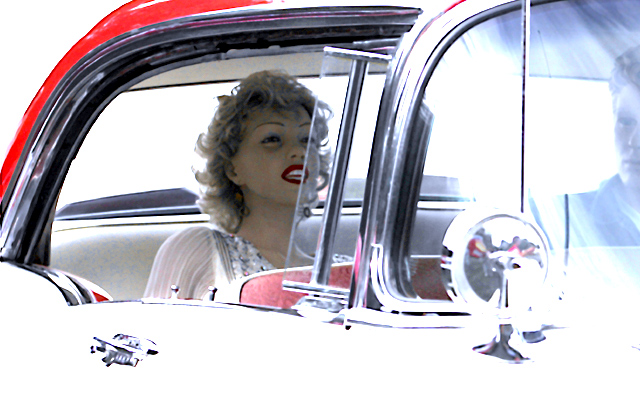
This image would make a very good high key image and has a good start to that end. However, I believe the transition between bright and dark areas of the image is way too harsh giving it the feel of overexposed rather than high key.
IMO, for high key to work all important detail should still be present with a nice even flow from bright to dark kind of like fading. |
|
 Photographer found comment helpful. Photographer found comment helpful. |
|
|
08/20/2005 12:41:31 PM |
| Neat shot, excellent editing, I like the way you have used the curves of the car's lines, really evokes the era |
|
| Photographer found comment helpful. |
|
|
08/18/2005 06:59:10 PM |
| Good grief! I didn't vote in this challenge, but I am dismayed at the number of commentators who obviously feel that the 'blown' portions of this image (and any image, I suspect) are by definition 'bad photography'. Of course, people are entitled to be narrow-minded. But surely they should at least have the wit to recognise that the photographer clearly intended the effect in this case, and isn't now sitting reading their comments, slapping her forehead and saying, "What was I thinking ... how could I have missed that?". |
|
| Photographer found comment helpful. |
|
|
08/18/2005 06:55:24 PM |
| I think using 'curves' in photoshop would have helped. |
|
| Photographer found comment helpful. |
|
|
08/17/2005 07:09:52 PM |
|
| Photographer found comment helpful. |
Comments Made During the Challenge  |
|
|
08/16/2005 10:29:39 PM |
| Very nice image. Might work even better without the face on the right edgr. Still my top pick this challenge! |
|
| Photographer found comment helpful. |
|
|
08/16/2005 08:05:38 AM |
| Wax Museum? Nice high-key approach... |
|
| Photographer found comment helpful. |
|
|
08/15/2005 05:47:24 PM |
| This is one of my favorites for this challenge. I like the overexposed area framing the main subject. |
|
| Photographer found comment helpful. |
|
|
08/15/2005 03:18:24 PM |
| The glare is a little distracting but this is an excellent pic and an original concept. |
|
| Photographer found comment helpful. |
|
|
08/15/2005 11:34:31 AM |
| very high key looking, but upon further study, perhaps you just cranked the levels to make the face show up? Her face is still underexposed. and why not crop a bit more on the right and lose the fellow? he does not add to the composition, but rather detracts from it. |
|
| Photographer found comment helpful. |
|
|
08/15/2005 10:09:18 AM |
| Hmmm...a bit too washed out along the front and bottom, but it does give it a certain look. 8 |
|
| Photographer found comment helpful. |
|
|
08/13/2005 07:12:06 AM |
| Like the way you captured 1957. Good job |
|
| Photographer found comment helpful. |
|
|
08/13/2005 12:42:34 AM |
| 6 - Good effort to capture the era for the Challenge (in my opinion, this shot put into a time capsule for this year captures it well - albeit 'highly stylized). Criticism; whilst I like the dummies - 'he' looks less real than 'her', so for me, detracts. So, in my opinion, either a blurring out more or a cropping out of him, would make this a better photograph in my opinion. I like the colors and the contrast, the lighting too, but just a tiny bit 'blown' (but I'm guessing that's what you were going for) in my opinion. Creative though, you went to a lot of trouble. |
|
| Photographer found comment helpful. |
|
|
08/12/2005 05:47:15 PM |
| Damn! I really, really, really want to love this photo, (I still have a crush on Marilyn from when I was a kid) but the burned out parts on the car, windshield and mirror just aren't helping here. I get that you were going for a stylized shot but as mentioned before I think keeping the detail of the classic car would make this shot blow you away. |
|
| Photographer found comment helpful. |
|
|
08/12/2005 04:30:19 PM |
| oo- did you have your flash on? or is that the sun? |
|
| Photographer found comment helpful. |
|
|
08/12/2005 08:32:45 AM |
Love this shot - great composition and lighting. The washed out highlights really work here to frame the subject .
|
|
| Photographer found comment helpful. |
|
|
08/11/2005 11:18:13 PM |
| if she were real, I'd love this! |
|
| Photographer found comment helpful. |
|
|
08/11/2005 10:50:52 PM |
|
| Photographer found comment helpful. |
|
|
08/11/2005 02:21:20 PM |
|
| Photographer found comment helpful. |
|
|
08/11/2005 02:17:23 PM |
| I really like this shot, but I wish the exterior of the car wasn't so blown out. |
|
| Photographer found comment helpful. |
|
|
08/11/2005 10:40:47 AM |
| My personal choice for a ribbon |
|
| Photographer found comment helpful. |
|
|
08/11/2005 08:19:45 AM |
| a pity the car is so overexposed |
|
| Photographer found comment helpful. |
|
|
08/11/2005 02:31:10 AM |
|
| Photographer found comment helpful. |
|
|
08/11/2005 12:56:41 AM |
| The high key effect is really cool. I wish the side window wasn't cutting through Marilyn's face. |
|
| Photographer found comment helpful. |
|
|
08/11/2005 12:15:47 AM |
| The stylization of this image is just great. I want to like it even more, but the post- processing is too much for me. The white is too bright (on the car and her teeth), the red of her lips is too red, and I am not sure if the blue I see around her eyes is eye shadow, effects of the processing, or just my eyes seeing things. 6 |
|
| Photographer found comment helpful. |
|
|
08/10/2005 07:06:11 PM |
| Seems too overblown, is taht a doll in the seat? |
|
| Photographer found comment helpful. |
|
|
08/10/2005 03:20:28 PM |
you have captured this time period well.
The over exposed highlights work a trat with this editing.
Great shot |
|
| Photographer found comment helpful. |
|
|
08/10/2005 12:54:37 PM |
|
| Photographer found comment helpful. |
|
|
08/10/2005 11:08:20 AM |
| great high key image...one of the best images here..well done. |
|
| Photographer found comment helpful. |
|
|
08/10/2005 09:40:31 AM |
| The image is over exposed |
|
| Photographer found comment helpful. |
|
|
08/10/2005 02:37:02 AM |
|
| Photographer found comment helpful. |
|
|
08/10/2005 02:30:25 AM |
|
| Photographer found comment helpful. |
|
|
08/10/2005 02:24:16 AM |
| Great idea however the image is blown IMHO. Maybe you should have gone to a high key image? |
|
| Photographer found comment helpful. |
|
|
08/10/2005 12:35:55 AM |
| I love the shinyness!! but the manicans kind of freak me out... nevertheless, a 7 from me! |
|
| Photographer found comment helpful. |
|
|
08/10/2005 12:32:07 AM |
| Excellent job, very creative, great colors and model! WOW! Awesome! |
|
| Photographer found comment helpful. |
Home -
Challenges -
Community -
League -
Photos -
Cameras -
Lenses -
Learn -
Help -
Terms of Use -
Privacy -
Top ^
DPChallenge, and website content and design, Copyright © 2001-2026 Challenging Technologies, LLC.
All digital photo copyrights belong to the photographers and may not be used without permission.
Current Server Time: 02/01/2026 11:53:16 AM EST.