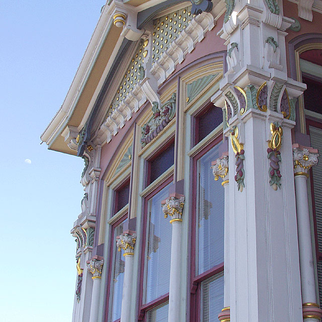
The Mish House, San Francisco, CA. This restored victorian is famous for its colorful paint scheme. A difficult building to shoot because you cant't get away from it without getting a lot of other thing in the picture. I tried a bunch of low angle shots to exemplify it decor.
Statistics
Place: 109 out of 225 Avg (all users): 5.1263 Avg (commenters): 6.9000 Avg (participants): 5.0183 Avg (non-participants): 5.2716 Views since voting: 1176 Votes: 190 Comments: 12 Favorites: 0
Finally, I am getting around to my mail. Thank you for your wonderful and complimentary evaluation of my "Painted Lady".
It was a wonderful Saturday in San Francisco, a rare clear day with very little wind. When I finally found the Mish House I immediately found the difficulty in getting pictures with normal lenses. A professional could have worked around this problem but as a novice I was quite lost. I was not happy with the flat finish on the house, from the information I had, I assumed it would be bright and shiny. I had came to specifically do this house and that is what I did.
I feel that you have given it a fair and honest critique, and certainly one that I appreciate. Of the many different crops, saturations and tilts I settled on this rendition-which probably doesn't do the old Victorian justice. I knew that the subject was a little off the challenge but as you probably can tell from reviewing my earlier entries, that doesn't really matter much to me. The entry would have had to be a lot splashier with defined colors, and a little trickery to do well on DPC, but I like it and several others liked it, and most of all I had fun doing it.
You must have a never-ending array of subjects in beautiful Montana. Your pictures reflect your ability to seek and present them for our enjoyment please don't ever stop!
Thank you, keep shooting, and most of all have fun.
Hi Richard, I'm not sure as I feel qualified to critique your images. I have seen and admired your work since I first joined DPC, so you are someone who I have learned from. I especially like your creativity with the subjects of your photos. So, instead of saying critique, I'm going to attempt to express my thoughts as I view your photo as a part of my assignment in the Critique Club.
Meeting the Challenge: Yes, you met it. You definately chose a wonderful subject to meet the objective of the challenge. This looks like a very interesting building to see in person.
Composition: The angle at which you shot this picture is nice and effective. I agree with you...with the angle, you are able to see details that you would probably wouldn't otherwise see. The moon showing up next to the building is a nice touch. With the overcast sky and lack of clouds, it provides something different and interesting. However, with this picture, I may have cropped it a little closer to the moon taking out more of the blaa of the sky. Also, I may have cropped out a little off the right side of the building closer to the corner pillar...just to get it closer to a printable sized picture. I think that would be possible without taking out important aspects of the building.
Technical Aspects: Appears to be well focused. Can easily see the details of the building. Someone mentioned in the comments that they thought it looked grainy but I don't see it. I think the top darkened windows have some sort of texture to it that might look grainy in the picture but other than that, I don't know what they are seeing. I do believe, however, that the colors could "pop" out a little more. They appear muted. Perhaps adjusting the contrast and/or pushing up the saturation a little would make the colors stand out more.
Overall: Richard, it's another interesting and unique photo to add to your portfolio. I'm always anxious to see what you come up with next.
Interesting subject. It feels like you were torn between shopoting the main subjetc and getting the moon in too. I think you'd have been better concentrating on the subject. Nice colours.