| Author | Thread |
|
|
05/27/2003 10:19:33 PM |
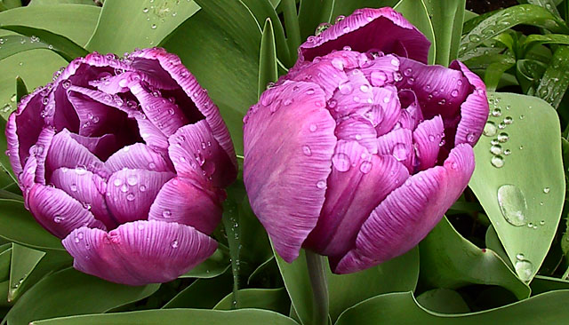
I thought about cropping to keep only the right side tulip & the leaf with droplets - I know that that would be a better composition. But there was something about the tulip on the left that I liked so much that I didn't want to remove it from the picture.
Some say "nice & sharp"; others would have preferred a macro with blurred background. This was taken between showers and I wanted to show all the water droplets on the petals and leaves. Just my own preference on this occasion. |
|
|
|
05/27/2003 06:49:28 PM |
*Critique Club*
I'm sitting here trying to think of somethings to say. I'm staring at the picture, I've read the comments, and I'm still at a loss of words really.
I read that the focus is really great, and look at the shot, and it is great in some places, most places for that matter, but when I look at the water drops, I wish that they were ALL as clear as the ones on the leaf. I'm thinking though that this maybe due to the texture and pattern on the flowers showing through the drops, making them look busy, when there isn't anything really showing through the ones on the big leaf to the right making them nice and clear and sharp?
I do think that it feels a little unballanced. I wonder if you had focused on just the right flower and the leaf, if this could have helped some. I'm just throwing that out as something to try. Probably something i'd have to SEE in order to say if it really works or not.
The colors are really nice. Purple and Green definately fit into the challenge.
The lighting seems to have been working with you this day. I think that the light shining in the drops is really nice.
This shot doesn't really appeal to me, however, it doesn't NOT appeal to me either. I'm rather indifferent about it. Well done, just nothing that makes me jump out of my seat with excitement.
~Heather~ |
|
 Photographer found comment helpful. Photographer found comment helpful. |
|
|
05/21/2003 05:07:47 PM |
I really liked this one, I gave it a 10. Too bad it didn't place higher.
The droplets on the petals are a great touch, and I also love the colors. |
|
Comments Made During the Challenge  |
|
|
05/20/2003 11:54:33 PM |
| The petals look almost metalic. Cool. |
|
| Photographer found comment helpful. |
|
|
05/20/2003 02:28:54 PM |
| Terrific detail and the focus is right on. Great color... the purple is very vivid. So life like I feel I could just reach in and pluck one! If the image has any shortcoming, I believe it to be it's composition. The right hand side of the photo bothers me slightly in that the green leaf stands in competition to the main flowers. . But all in all, this is my favorite image for this challenge and I gave it the highest score. |
|
| Photographer found comment helpful. |
|
|
05/20/2003 02:47:33 AM |
| Lots to like about this shot...focus is great, composition is interesting, focus is spot on, exposure is great...but...the colors do look a bit like the water washed them out! I'd love to see more color saturation and a little less sharpening, but a very good effort overall. ~Renee |
|
| Photographer found comment helpful. |
|
|
05/19/2003 07:16:47 PM |
|
|
|
05/18/2003 12:19:51 PM |
| Wow rich texture. Nice pleasing colours. nice shot. 9 |
|
|
|
05/17/2003 10:49:38 PM |
|
|
|
05/17/2003 09:14:30 PM |
|
|
|
05/17/2003 11:56:42 AM |
(IMHO) looks alittle overexposed? or something. A better DOF choice to blur the background foilgage would have allowed the Flower to stand out more.=5
|
|
| Photographer found comment helpful. |
|
|
05/16/2003 06:50:46 AM |
| Very sharp, and the contrast !! |
|
|
|
05/15/2003 01:39:52 PM |
| Good image. I like the clarity of the image and the quality of the image. The water on the object also provides a nice value and texture of the image. |
|
|
|
05/15/2003 10:58:11 AM |
|
|
|
05/14/2003 02:59:30 PM |
| I like the drops and it's nice and sharp but I can see you've got a dilemma here. To me it looks a little unbalanced as is, but if you crop on the right to even things up, you'll lose all those nice raindrops on that leaf. What to do? Decisions, decisions... Can you put a bit back on the left? Oh, I like the colours too. |
|
| Photographer found comment helpful. |
|
|
05/14/2003 02:18:35 PM |
|
|
|
05/14/2003 11:54:02 AM |
| really nice.... bit slightly over brightned |
|
|
|
05/14/2003 01:16:02 AM |
| The tight crop on the left with the extra space on the right, presumably to show off the leaf with the water droplets, gives the photograph an unbalanced feel. The texture of the leaves are great, and the droplets on the leaves add something to it as well, but not sure about such large droplets on the flowers themselves - it is almost like they command attention more than the detail of the petals. |
|
| Photographer found comment helpful. |
Home -
Challenges -
Community -
League -
Photos -
Cameras -
Lenses -
Learn -
Help -
Terms of Use -
Privacy -
Top ^
DPChallenge, and website content and design, Copyright © 2001-2026 Challenging Technologies, LLC.
All digital photo copyrights belong to the photographers and may not be used without permission.
Current Server Time: 02/01/2026 08:33:38 AM EST.