| Author | Thread |
|
|
05/22/2003 07:58:22 AM |
Greetings from the Critique Club.
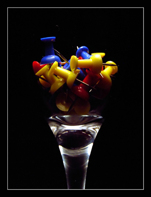
Nice idea and composition. I think a little extra lighting this would have made this one better. It may have been easier to focus the camera with more light as well, whether you use auto or manual. Aside from those things I think one thing that may have been overlooked is the over obundance of yellow in the picture. I would have tried to balance it out more. Either way with a little extra lighting and sharper focus I think this one would have done much better. Keep up the good work and lots of luck in future challenges. |
|
 Photographer found comment helpful. Photographer found comment helpful. |
Comments Made During the Challenge  |
|
|
05/16/2003 09:52:20 AM |
| could have benefitted from "tack sharp" focus.. (sorry, couldn't resist the pun!) and just a tad more light under the pushpins to bring out a little more of their colour. |
|
| Photographer found comment helpful. |
|
|
05/15/2003 07:25:52 PM |
| Great idea. Bit on the dark side, even though it was to "erase" the glass and give the floating appearance. one small area of background noise |
|
| Photographer found comment helpful. |
|
|
05/15/2003 01:39:45 PM |
| Nice Composition, I think it works very well. |
|
| Photographer found comment helpful. |
|
|
05/13/2003 06:32:10 AM |
|
| Photographer found comment helpful. |
|
|
05/13/2003 05:46:30 AM |
| I like the subdued lighting. |
|
| Photographer found comment helpful. |
|
|
05/12/2003 01:53:42 PM |
| Now that's interesting ... the glass disappeared ... Very neat. Jacko. 9 Very nice lighting job. |
|
| Photographer found comment helpful. |
|
|
05/12/2003 10:42:01 AM |
| I love push pins!!! These are nice-good work with the lighting. |
|
| Photographer found comment helpful. |
|
|
05/12/2003 10:37:18 AM |
| the abstract of this photo is quite appealing, but I have to say that the title doesn't do much for it :) |
|
| Photographer found comment helpful. |
|
|
05/12/2003 07:43:15 AM |
| They are inside an invisible glass?! Very primary colors. I'd like to see a little more even lighting and composition - more push pins, more red visible. |
|
| Photographer found comment helpful. |
|
|
05/12/2003 04:50:09 AM |
| ...yet a good picture, like it (the push pins are a hell of a lot better then flowers or flags....) |
|
| Photographer found comment helpful. |
|
|
05/11/2003 08:30:31 PM |
| Beautiful composition. I dislike your lighting - looks top-down. What is it sitting on? A tee? |
|
| Photographer found comment helpful. |
Home -
Challenges -
Community -
League -
Photos -
Cameras -
Lenses -
Learn -
Help -
Terms of Use -
Privacy -
Top ^
DPChallenge, and website content and design, Copyright © 2001-2025 Challenging Technologies, LLC.
All digital photo copyrights belong to the photographers and may not be used without permission.
Current Server Time: 04/09/2025 12:07:31 PM EDT.