*Critique Club*
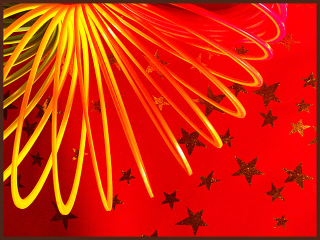
I think this is cute. The yellow and red are quite clear, and are also nice and vivid. They stand out well.
I am undecided on the stars. I like them, cause they give this a playful kind of attitude, however, directly under the slinky, where the slinky pieces are close together, The stars make it a bit cluttered. So I guess I like them on the outter part of the slinky, but not inward where they are cramped.
Something I find to be a bit of a distraction is the green part of the slinky that peeks in from the left. The rest is so bright and cheerful, that the green sneaks in and creates a distraction.
For the challenge, I'd like to see some blue, however, I don't really see how you could add blue to make this look good. Unless maybe the stars were blue. Otherwise, I don't really think blue would fit in. It would be like that small patch of green in the corner, distracting.
Focus and clarity seem to be good in my opinion. And I love the framing/cropping you chose, with the slinky coming out of the upper left and the stars spilling out over the 'negative space'.
The lighting really makes this shot. I appreciate that there are no distracting shadows. That, in my opinion, would have ruined this shot for sure. Great job.
~Heather~ |