| Author | Thread |
Comments Made During the Challenge  |
|
|
05/18/2003 01:31:41 PM |
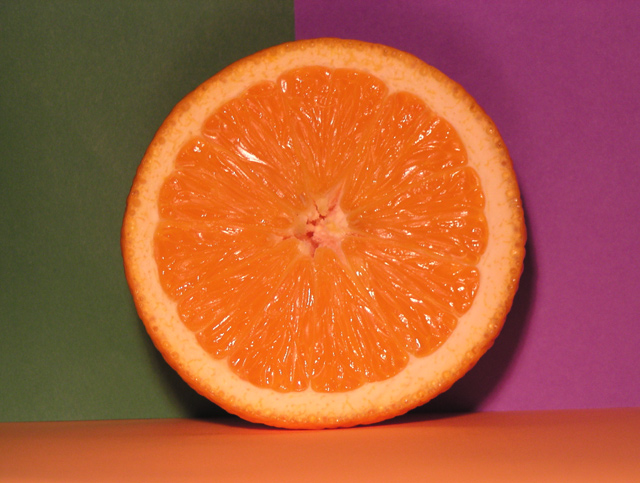
I like this one, except for a few lil bits. I don't know if its just me, but the purple paper and the table surface appear crooked. Also, I don't like the green/gray background (maybe have a bright green?).
Love the color overall colors and concept! 6 =-) |
|
|
|
05/16/2003 08:05:41 PM |
| Kind of nice idea, but there area couple of things that are killing it for me. Firstly, the flash lighting - really flattens things out, and leaves that very brutal shadow. Secondly the placing of the parts of the shot - and especially the lower surface: if you'd shot from a little lower you wouldn't have had the table in shot and there would have been more of just the colours. |
|
|
|
05/15/2003 08:39:56 PM |
| Hi. Not a bad shot at all. Your lighting could of been better, that the weak spot. Beyond that.........way to go. |
|
|
|
05/15/2003 05:28:55 PM |
| Nice idea. Needs a little more contrast or lightning. |
|
|
|
05/15/2003 11:39:06 AM |
| I like the use of the background. Seems a little washed out. |
|
|
|
05/14/2003 02:06:43 PM |
|
Home -
Challenges -
Community -
League -
Photos -
Cameras -
Lenses -
Learn -
Help -
Terms of Use -
Privacy -
Top ^
DPChallenge, and website content and design, Copyright © 2001-2026 Challenging Technologies, LLC.
All digital photo copyrights belong to the photographers and may not be used without permission.
Current Server Time: 02/01/2026 08:59:03 AM EST.