| Author | Thread |
|
|
08/06/2005 12:08:10 PM |
| I thought this was great and different! I gave it a 10. |
|
 Photographer found comment helpful. Photographer found comment helpful. |
|
|
08/06/2005 03:57:46 AM |
| Congrats on a top placement. I loved your originality and color contrast. |
|
| Photographer found comment helpful. |
|
|
08/06/2005 12:37:43 AM |
| So close to a top 20! Well done - nice job. |
|
| Photographer found comment helpful. |
Comments Made During the Challenge  |
|
|
08/05/2005 11:48:53 PM |
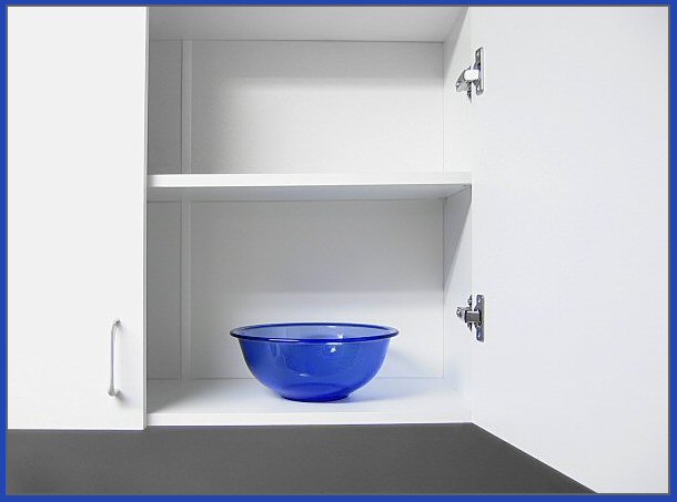
| There's something very interesting about this. Nice and neat. minimalist. I think the blue border adds a lot. |
|
| Photographer found comment helpful. |
|
|
08/05/2005 08:40:36 AM |
| I like the bleached out effect and the simplicity. |
|
| Photographer found comment helpful. |
|
|
08/03/2005 01:54:49 AM |
| The border is too thick in my opinion and draws too much attention away from the subect for me |
|
| Photographer found comment helpful. |
|
|
08/02/2005 10:20:54 PM |
| Color contrast is good, but perhaps a different angle? |
|
| Photographer found comment helpful. |
|
|
08/02/2005 01:43:08 AM |
| Okay this is going to sound weird, but the border really brings this shot together. Good job! |
|
| Photographer found comment helpful. |
|
|
08/01/2005 06:32:59 PM |
| This is a rare case where i love the border, it adds something to the picture, the blue bowl and border againts all the white is beautifull. great picture. |
|
| Photographer found comment helpful. |
|
|
08/01/2005 03:31:59 PM |
| One of my top favorites. Classy, simple & well executed. 10 |
|
| Photographer found comment helpful. |
|
|
08/01/2005 09:41:24 AM |
So clear and clean - simple but very effective.
Well done |
|
| Photographer found comment helpful. |
|
|
07/31/2005 08:41:03 PM |
|
| Photographer found comment helpful. |
|
|
07/31/2005 05:04:46 AM |
| Good. Captures apartment living hardcore, though the cabinets look like they reside within a house. This pointless observation aside, I think this is a solid composition you have constructed here. 7. |
|
| Photographer found comment helpful. |
|
|
07/30/2005 05:42:45 PM |
| I'm not keen on the blue border, and the whites seem a bit over exposed. |
|
| Photographer found comment helpful. |
|
|
07/30/2005 03:07:55 PM |
Really nice minimalist shot with the right amount of colour
well done i like it
good luck |
|
| Photographer found comment helpful. |
|
|
07/30/2005 10:51:07 AM |
| I like the way the border works here. |
|
| Photographer found comment helpful. |
|
|
07/30/2005 09:07:45 AM |
| Clever, I like the idea and the image. |
|
| Photographer found comment helpful. |
|
|
07/30/2005 01:01:50 AM |
| I love this! This is fantastic! |
|
| Photographer found comment helpful. |
|
|
07/30/2005 12:58:22 AM |
| frame is a bit thick - would have made it only half as wide |
|
| Photographer found comment helpful. |
|
|
07/30/2005 12:32:29 AM |
| Oh this is so clever Great use of dual coloration. I like this so much. The roundness of the bowl against the straight lines of the cabinet - really well thought out. Crisp focus. |
|
| Photographer found comment helpful. |
Home -
Challenges -
Community -
League -
Photos -
Cameras -
Lenses -
Learn -
Help -
Terms of Use -
Privacy -
Top ^
DPChallenge, and website content and design, Copyright © 2001-2026 Challenging Technologies, LLC.
All digital photo copyrights belong to the photographers and may not be used without permission.
Current Server Time: 02/01/2026 11:03:09 AM EST.