| Author | Thread |
Comments Made During the Challenge  |
|
|
08/05/2005 01:30:48 AM |
Have to recommend for DQ - photo has to have been taken THIS YEAR. ;-)
Nice treatment. Interesting place. Well done. |
|
 Photographer found comment helpful. Photographer found comment helpful. |
|
|
08/04/2005 03:44:10 PM |
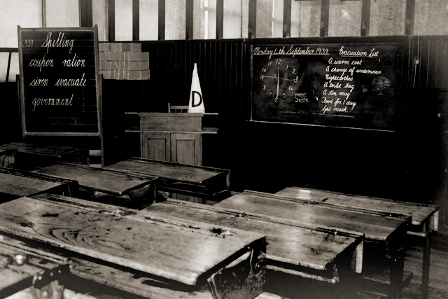
| D cap is too strikingly prominent. Would've looked better left in a shady corner like a bad secret. |
|
| Photographer found comment helpful. |
|
|
07/30/2005 12:38:11 PM |
| nice mood lighting and use of sepia |
|
| Photographer found comment helpful. |
|
|
07/30/2005 09:55:37 AM |
| Wish the dunce cap weren't such a glaring white. Would have like to have seen that toned down a bit as it seems to take away from the rest of this amazing picture. |
|
| Photographer found comment helpful. |
|
|
07/30/2005 09:42:10 AM |
| The tables in the front are a bit out of focus, and the contrast seems a little flat to me, but the composition and detail in the setting are done well. |
|
| Photographer found comment helpful. |
|
|
07/30/2005 01:24:25 AM |
|
| Photographer found comment helpful. |
|
|
07/30/2005 12:59:34 AM |
|
|
|
07/30/2005 12:16:38 AM |
| Love this. The dunce cap is great!!! I thought of this idea but I don't know where schools look like this any more. Perfect use of sepia. Maybe a little busy, but I like it. |
|
| Photographer found comment helpful. |
Home -
Challenges -
Community -
League -
Photos -
Cameras -
Lenses -
Learn -
Help -
Terms of Use -
Privacy -
Top ^
DPChallenge, and website content and design, Copyright © 2001-2026 Challenging Technologies, LLC.
All digital photo copyrights belong to the photographers and may not be used without permission.
Current Server Time: 02/01/2026 09:02:37 AM EST.