| Author | Thread |
|
|
07/30/2005 04:54:37 PM |
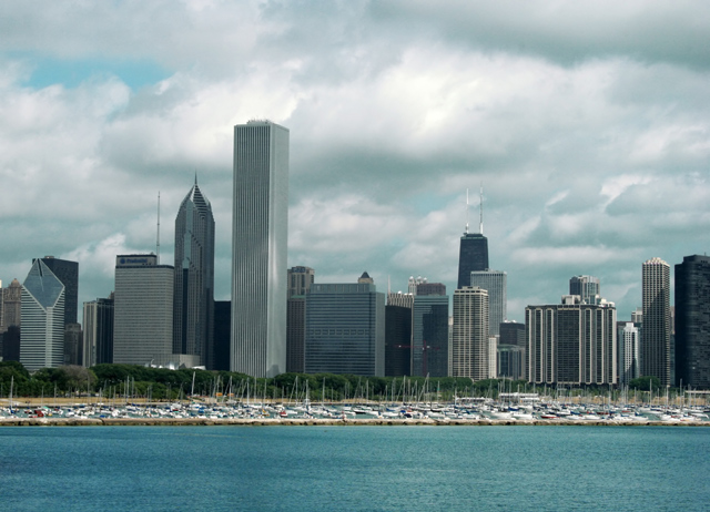
| I like the torquoise of the water but find it odd that the sky is the same color. Is there a way to make the sky bluer and the water cyaner. I do not understand selective color at all, it doesn't make any sense to me yet. I can see that it has done great things for your picture here, making an overcast city look so much sharper and more interesting. I especially like what it did to the black, the greens and to that lovely cloud reflection on the tall straight building. Are those boats in the foreground? I never pictured Chicago with boats. In fact I never pictured Chicago as anything but big and gray. Maybe I need to visit someday, you make it look so sparkly. |
|
 Photographer found comment helpful. Photographer found comment helpful. |
|
|
07/28/2005 01:28:01 PM |
It does certainly look better than the original - very good job so far. Much improved, yet still natural looking.
I don't think that the clouds necessarily need to be more dramatic, but I think I might actually prefer a slight bit more contrast (particularly in the buildings, and a little in the sky) - perhaps another curves adjustment? |
|
| Photographer found comment helpful. |
|
|
07/27/2005 07:51:27 PM |
| I think you did a great job- the clouds and the blue hues are especially outstanding :0) |
|
| Photographer found comment helpful. |
|
|
07/27/2005 06:17:57 PM |
| I liek the way the water is darker and the clouds are lighter. I like the darks and highlights in the buildings. Overall a very nice job. |
|
| Photographer found comment helpful. |
|
|
07/27/2005 05:54:31 PM |
Thanks Jeileen. I tried dodge and burn but I don't have a handle on those tools yet so it pretty much looked horrible. Hopefully as I learn more I'll be able to improve the photo.
And as I look at it now it looks like the horizon is tilted to the right a bit. Back to PS I go.
Message edited by author 2005-07-28 16:01:23. |
|
|
|
07/27/2005 05:10:17 PM |
| Nice. I think the crop is nice. The colors are great as well. The buildings really stand out. I am not an expert with dodge and burn - but had you thought about playing around with these tools to make the clouds more dramatic? |
|
| Photographer found comment helpful. |
Home -
Challenges -
Community -
League -
Photos -
Cameras -
Lenses -
Learn -
Help -
Terms of Use -
Privacy -
Top ^
DPChallenge, and website content and design, Copyright © 2001-2025 Challenging Technologies, LLC.
All digital photo copyrights belong to the photographers and may not be used without permission.
Current Server Time: 04/07/2025 09:08:20 PM EDT.