| Author | Thread |
|
|
10/27/2005 12:40:44 PM |
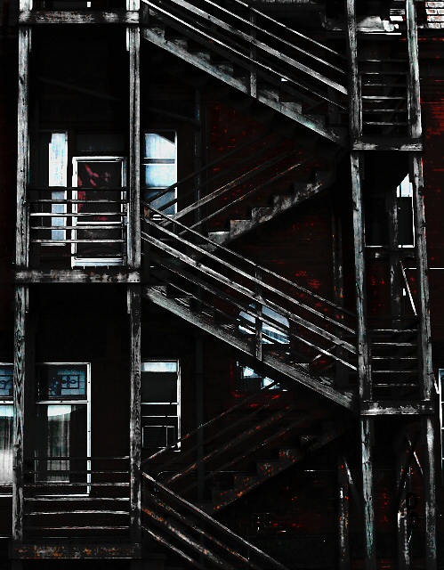
| Fantastic shot - Love the processing and presentation. You're right - I don't want to climb them! ;-) |
|
 Photographer found comment helpful. Photographer found comment helpful. |
Comments Made During the Challenge  |
|
|
07/31/2005 09:13:49 PM |
| Very interesting and depicting great age. |
|
| Photographer found comment helpful. |
|
|
07/31/2005 02:12:07 PM |
| interesting processing. nicely dark. |
|
| Photographer found comment helpful. |
|
|
07/30/2005 05:18:03 PM |
really like the blacks/browns/blues here (minor point but I'd like the sides even/level) the title draws a conclusion for the viewer but there is more mystery in the photo - potentially ;)
One of my ribbon picks |
|
| Photographer found comment helpful. |
|
|
07/29/2005 05:20:48 PM |
| This is great in many ways- subject, composition and treatment. I'm curious to know how this effect was achieved! |
|
| Photographer found comment helpful. |
|
|
07/29/2005 03:23:06 PM |
| Interesting, reminds me somehow of a scene in "Batman Begins" when Batman and Gordon are chatting in Gordons "back yard". Love the darkness and tones in this shot, good job. |
|
| Photographer found comment helpful. |
|
|
07/29/2005 01:43:20 PM |
| Very cool... I love the darkness in this. Also, makes a very interesting picture with the bits of color in the windows and doorways. 10 |
|
| Photographer found comment helpful. |
|
|
07/28/2005 05:22:45 PM |
|
|
|
07/28/2005 05:12:46 PM |
| Interesting shot. Nice take on the challenge. I like the tone/mood set in this image. Good job. |
|
| Photographer found comment helpful. |
|
|
07/28/2005 01:47:22 PM |
| Nice composition. Good lighting. |
|
| Photographer found comment helpful. |
|
|
07/28/2005 10:11:05 AM |
| great composition, use of de-sat and contrast |
|
| Photographer found comment helpful. |
|
|
07/27/2005 08:56:36 AM |
|
|
|
07/27/2005 07:51:43 AM |
| Like the subject but it´s to dark. |
|
| Photographer found comment helpful. |
|
|
07/26/2005 05:13:34 AM |
| If this is after a fire, difficult to lighten black....7 |
|
|
|
07/25/2005 11:13:01 PM |
| the colors seem very un-natural and dark and even a little "splotchy"/uneven. i think it works though, it's very artsy. 9. |
|
| Photographer found comment helpful. |
|
|
07/25/2005 08:06:11 PM |
Subject Impact: Nice visual impact
Meets Challenge: Meets Challenge
Technical: OK
Composition: Good
Creativity: Good Idea
Score: 4 |
|
| Photographer found comment helpful. |
|
|
07/25/2005 04:08:16 PM |
| Very gritty. Well done composition, lighting, and mood. 8 |
|
| Photographer found comment helpful. |
|
|
07/25/2005 03:50:22 PM |
love the contrast and tones here, great eye
8 |
|
| Photographer found comment helpful. |
|
|
07/25/2005 12:35:37 PM |
| This is a nice photo. It seems a bit dark or too contrasty though. |
|
| Photographer found comment helpful. |
|
|
07/25/2005 11:12:49 AM |
| I like it has a dark, aged effect. Good composition and use of lighting! |
|
| Photographer found comment helpful. |
|
|
07/25/2005 10:44:24 AM |
| In this challenge, "Creativity is the Key" is what I am using to score images. Not too thrilled about the title but I love the image. The tilt on the right is a little distracting but it is due to a ground level POV - we take what we can. I really like the tones - many might complain it is too dark but I think that is what works for me. The reflections in the glass add movement to what otherwise might be static. Crop is a little tight for my tastes but overall, well done and creative! 7 - good luck in the challenge! |
|
| Photographer found comment helpful. |
|
|
07/25/2005 09:13:41 AM |
| Great leading lines. I love the zig zag of the stairs. The hint of blue and red here and there is effectibe. I like all the dark of it too. Nicely done. |
|
| Photographer found comment helpful. |
|
|
07/25/2005 08:15:07 AM |
| Very nice picture. You might want to adjust the verticle lines so that they are straight up and down. It's also a tad dark. |
|
| Photographer found comment helpful. |
|
|
07/25/2005 07:36:56 AM |
| This seems like it would be an interesting composition but it is way too dark. |
|
| Photographer found comment helpful. |
|
|
07/25/2005 01:47:58 AM |
| Looks like a Joey Lawrence |
|
|
|
07/25/2005 01:11:00 AM |
| You have really captured a mood in this photo, like the people who live there are fighting against overwhelming odds |
|
| Photographer found comment helpful. |
Home -
Challenges -
Community -
League -
Photos -
Cameras -
Lenses -
Learn -
Help -
Terms of Use -
Privacy -
Top ^
DPChallenge, and website content and design, Copyright © 2001-2026 Challenging Technologies, LLC.
All digital photo copyrights belong to the photographers and may not be used without permission.
Current Server Time: 02/01/2026 08:32:49 AM EST.