| Author | Thread |
Comments Made During the Challenge  |
|
|
05/13/2003 11:02:20 AM |
|
|
|
05/13/2003 09:57:02 AM |
| this photo could be better if it wasnt so pixelated |
|
|
|
05/13/2003 07:20:35 AM |
| Looks a little blurry! Might need to adjust your DOF. |
|
|
|
05/09/2003 03:46:14 AM |
| Poor focus, composition and you can`t even tell what it is. |
|
|
|
05/09/2003 12:44:34 AM |
| poor macro shoot, can't get sharp object |
|
|
|
05/08/2003 02:31:59 PM |
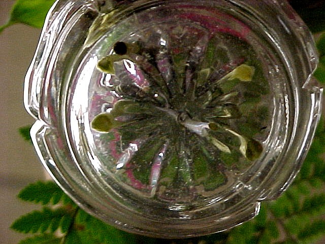
Very novel concept, let down by the following:
Seems to be a lot of noise (could have been prevented by using more light and a lower ISO). there is also very uneven lighting, far too much from the left, might have been better to have had your light from behind the fern.
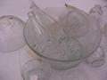
The ashtray looks dirty, so if it had been poperly cleaned prior to the challenge it might have paid to have bought a new one which might have been a bit clearer.
Feel that the empty space on the left should have been filled with the fern to create a more symetric foto. Would also have been nice to see the colour of the flowers the whole way around the base of the ashtray. |
|
|
|
05/07/2003 03:36:48 PM |
| Youre idea was good but the overpowering light hurt you quite a lot. You might try putting a sheet or something over the windowor light source to break up the light so you don't get so much damaging glare. 4 |
|
|
|
05/07/2003 08:27:57 AM |
| this is a bit too dark for my tastes, would like to have seen more of the detail |
|
|
|
05/06/2003 09:08:41 PM |
| not sure why you cropped the top of the candle out - it takes away some of the symmetry for me. a little grainy on the leaves as well - on purpose? |
|
Home -
Challenges -
Community -
League -
Photos -
Cameras -
Lenses -
Learn -
Help -
Terms of Use -
Privacy -
Top ^
DPChallenge, and website content and design, Copyright © 2001-2025 Challenging Technologies, LLC.
All digital photo copyrights belong to the photographers and may not be used without permission.
Current Server Time: 04/09/2025 10:31:33 AM EDT.