| Author | Thread |
Comments Made During the Challenge  |
|
|
05/13/2003 10:28:58 AM |
|
|
|
05/13/2003 10:00:03 AM |
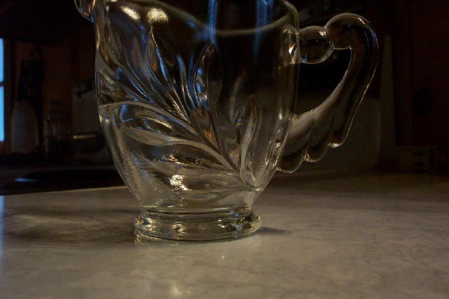
| if there was less negative space in the photo it would look a little better. |
|
|
|
05/13/2003 06:01:18 AM |
I like the lighting effects on the pitcher. I would have cropped the bit of wondow on the left though and maybe tried to frame the whole pitcher in the shot.
Mark
|
|
|
|
05/12/2003 08:12:18 PM |
| This is a nice piece. The background makes it hard to see the pitcher. A white background would have been a good choice. I use poster board. |
|
|
|
05/12/2003 10:38:24 AM |
| nice idea, why did you crop the top of the pitcher out, i think that it may have made the image better 3 |
|
|
|
05/10/2003 03:31:55 PM |
| It likes like you were trying to pick up the blue lighting in the jug, good idea. your picture is however let down by the a lack of cropping. You really should have cropped a bit off the left so the window is out of site. If possible would also have suggested putting a black top ove the bit of light just to the left of the jug. I would also like to have seen any reflection there would have been on the rim. Prehaps by shooting this shot as a protrait rather than landscape, might have resolved some of these issues. |
|
|
|
05/10/2003 03:01:12 PM |
| Had it been centered better or cropped better, it has some nice qualities. |
|
|
|
05/09/2003 02:53:39 PM |
| I would have cropped in differently. Needs to be brightened. Good job. |
|
|
|
05/09/2003 11:40:03 AM |
| The lighting isn't very good (too dark), and glass is cut off at the top. Try shooting it in "portrait". |
|
|
|
05/09/2003 07:56:18 AM |
| i wouldn't have cropped the top off of this, but I would have cropped the window and some of the cluttered background out. Using a longer lens (zoom) or a backdrop would also help with that. |
|
|
|
05/09/2003 03:53:58 AM |
This image meets the challenge, all right... but I'm afraid it's not very attractive to me. I hope that I not offend you by saying this.
I think the area of improvement mainly lies in the composition: cutting off the top of the object and the distracting blue 'streaks' (window?) on the left.
Other: the image is a bit underexposed, wich translates in loss of detail in the object.
If I may give a tip: try to take more time for the composition of the image. Try to shoot the object from different angles. Use different materials as a background...
Hope this was helpful. Regards, Marco |
|
|
|
05/08/2003 03:18:07 PM |
| The composition and background distract slightly from this shot. The blue light in the background does reflect well in the glass though. |
|
|
|
05/08/2003 10:12:59 AM |
| I like the clarity of this photo although the lighting could be a little better. |
|
|
|
05/07/2003 08:08:23 PM |
| you should't have cut off the top..........:( |
|
|
|
05/07/2003 01:53:48 PM |
| I don't really understand the purpose behind the cropping here. I think if it were symmetrical in both directions, or asymmetrical in both, it would work. The way it's set up here, it looks accidental to me. |
|
Home -
Challenges -
Community -
League -
Photos -
Cameras -
Lenses -
Learn -
Help -
Terms of Use -
Privacy -
Top ^
DPChallenge, and website content and design, Copyright © 2001-2025 Challenging Technologies, LLC.
All digital photo copyrights belong to the photographers and may not be used without permission.
Current Server Time: 04/06/2025 10:41:18 PM EDT.