| Author | Thread |
Comments Made During the Challenge  |
|
|
06/09/2002 10:29:00 AM |
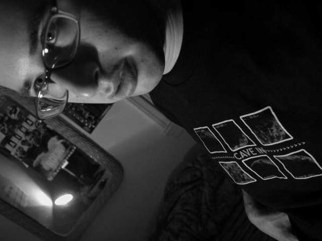
| like the light but should it be in the mirror? |
|
|
|
06/09/2002 12:41:00 AM |
| Whatcha sayin'? Interesting angle / composition, but it's not getting through to me. |
|
|
|
06/08/2002 11:18:00 AM |
| Just can't relate, it seems like no thought went into this...just a random self portrait snap shot. |
|
|
|
06/05/2002 07:59:00 PM |
| Its an interesting photo. I'm not sure where the subject is as you have three different points that I look at, the face, the light in the mirror and the "Cave in" on the t-shirt. The glasses have some spots that reflect the light and you've got a shiny nose. I think you have a decent idea of photography, but the whole thing just doesn't work for me. |
|
|
|
06/05/2002 12:34:00 PM |
| This shot shows a lot potential, I might suggest that a different camera placement would have helped express this better, or course this is highly subjective, so it's just my two cents worth. |
|
|
|
06/05/2002 10:14:00 AM |
| Not the usual portrait. Credit for creativity. |
|
|
|
06/05/2002 07:47:00 AM |
| Luke... I am your faahhthhaa :) |
|
|
|
06/04/2002 06:24:00 PM |
| not the most flattering of poses I don't think. Glasses look very crooked and I'm sure you've heard about the light...too bright(IMO), draws my eye towards it and creates shiny spot on glasses, nose, and forehead. |
|
|
|
06/04/2002 02:54:00 PM |
| I love the look on the face, and it's a quite interesting composition. I would rather the the light was not visible, the whole area below the face is slightly distracting. |
|
|
|
06/04/2002 06:10:00 AM |
| good grief. what were you thinking... |
|
|
|
06/03/2002 06:30:00 PM |
| to much darkness and not enough contrast of lights and darks |
|
|
|
06/03/2002 03:39:00 PM |
| Bad pic, sideways and our of focus, what was the point of this? |
|
|
|
06/03/2002 12:01:00 PM |
| Exellent b&w. Well done!!!!!!!! |
|
|
|
06/03/2002 07:13:00 AM |
| Did you rotate the photo so we could read the guy's shirt better or for some other reason I don't get? Also, the bright light in the lower left corner is distracting. |
|
Home -
Challenges -
Community -
League -
Photos -
Cameras -
Lenses -
Learn -
Help -
Terms of Use -
Privacy -
Top ^
DPChallenge, and website content and design, Copyright © 2001-2025 Challenging Technologies, LLC.
All digital photo copyrights belong to the photographers and may not be used without permission.
Current Server Time: 04/07/2025 12:46:21 PM EDT.