| Author | Thread |
|
|
07/26/2005 01:49:28 PM |
Greetings from the Critic Club! :)
For creativity alone, you deserve a 10 on this. However, images are not only rated on creativity but technique, presentation, and appeal/emotional response.
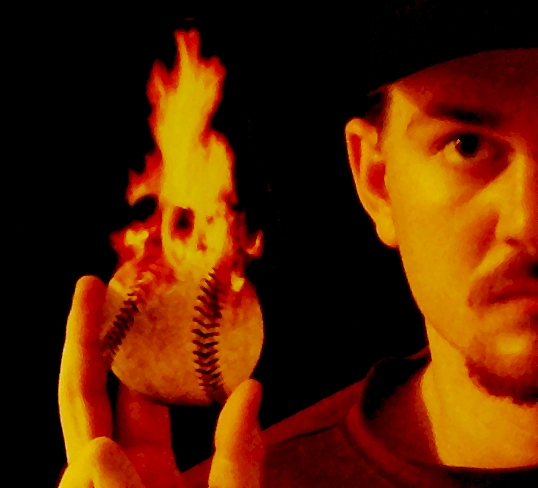
Technique - The blurring here is one of those love it or hate it propositions. Here at DPC, people usually hate it because they want their photos to look 'real.' I would argue, however, that the blur is effective here in lending the image an artistic quality (have you ever heard of LeRoy Neiman? check him out). You could go in the completely opposite direction but I am afraid it wouldn't be within the limits of this image. I think the use of the orange tones is effective but a little overdone in the skin tones as they compete with the flame that should rightly be the focus of this image. To me, the ball looks cut out. This is due to the lack of shadow and the hard edge on the right hand side. This may be fixed using a slight edge blur or some D&B to give the illusion that the light on the ball is the same as the light on the figure. See how the bottom has a slight shadow? Some of that should be echoed on the right side. An inperceptible amount would really hide the fact that the ball is not real.
Presentation/Composition:
I think the 1/2 head works really well. The viewer unconsiously fills in the rest of the face anyway, which makes the image larger than it really is. Using this was a great compositional tool. While the hat disappearing into the background is odd, the shadow left by the hat on the subjects face immediately lets the viewer know that there is indeed a baseball hat there. I think this shadowing works well and to the image's advantage. To be honest, I find the hand and arm position awkward, but that is easily overlooked as attention is drawn away from that aspect. In other words, I don't dwell on it. I think a more effective placement would be a little further from the body forward, a more natural position for a pitcher. There may be a little more room than necessary on the left side of the frame; I don't think a slight crop of a little black space would hurt.
Emotional Appeal:
This image would appeal mostly to people into baseball. Particularly those into Art prints.
With regard to the Sports II Challenge:
Having been at DPC for a while I can often tell which images are going to 'score big' and which are going to be passed by. This image, since it bases its appeal on the artistic side, will suffer in the voting. With further instructions calling for action, the expectation of many of the voters was for specific action. Since all the action in your image is done by the flame (perception wise), most people would vote low for lack of sports action. But, that doesn't mean this is not a great image - many comments below would attest to that! It just means that, within the confines of this particular challenge, the image didn't give the voter's what they were looking for. In a challenge called flame where the description asked you show something on fire, I'm sure this would have scored in the 6's.
My personal opinion? I love it. I think it could use a little more work as noted above, but I love baseball, I love creativity, and I love outside the box thinking.
If you have any questions, please feel free to PM at your leisure. |
|
 Photographer found comment helpful. Photographer found comment helpful. |
Comments Made During the Challenge  |
|
|
07/19/2005 11:50:31 AM |
Hot idea! Needs to be in focus IMO.
Keep trying... |
|
|
|
07/17/2005 06:53:29 PM |
| Creative and well composed. |
|
|
|
07/17/2005 03:53:10 PM |
|
|
|
07/17/2005 03:07:57 AM |
|
|
|
07/16/2005 05:42:07 PM |
| did you burn your fingers? |
|
|
|
07/16/2005 10:43:35 AM |
(1-2) Below Average (3) Average (4-5) Above Average
Challenge Relevance : 3
Contrast / Colors :2
Creativity / Originality :4
Composition / Eye Appeal: 3
Grain and a ovely orange tint for my liking, Awsome idea just not as hapy with the end result to rate higher. |
|
| Photographer found comment helpful. |
|
|
07/15/2005 10:09:27 PM |
| I very much like the composition though I'm not too sure about the processing. A little too much yellow and red applied. |
|
| Photographer found comment helpful. |
|
|
07/15/2005 09:37:29 PM |
| Not sure I like the extreme over processing. Nice idea and capture, but a little too much on the effects for me. |
|
|
|
07/15/2005 08:00:30 PM |
| Interesting, but personal preference would prefer white balance adjustment...6... but I understand not having enough time to setup shot completely. |
|
|
|
07/14/2005 02:41:03 PM |
| The challenge called for a sports action shot. Where is the action? |
|
|
|
07/14/2005 06:04:22 AM |
| How'd you do this with no manipulation? |
|
|
|
07/13/2005 07:47:30 PM |
| I enjoy your creative approach. Don't see enough acceptance of that much. |
|
|
|
07/13/2005 05:11:32 PM |
|
|
|
07/13/2005 02:03:40 PM |
| awesome imagination you have there !! 7 |
|
|
|
07/13/2005 12:03:50 PM |
| beautiful shot, but it looks a little too post processed -- did you apply a water color filter to this? i think the composition is wonderful -- i would have given it a 10 if it were "pure." |
|
|
|
07/13/2005 04:57:38 AM |
|
|
|
07/13/2005 01:47:58 AM |
| The ball needs to be in focus, it looks like, and quite possibly could be, fake |
|
Home -
Challenges -
Community -
League -
Photos -
Cameras -
Lenses -
Learn -
Help -
Terms of Use -
Privacy -
Top ^
DPChallenge, and website content and design, Copyright © 2001-2026 Challenging Technologies, LLC.
All digital photo copyrights belong to the photographers and may not be used without permission.
Current Server Time: 02/01/2026 09:34:31 AM EST.