| Author | Thread |
Comments Made During the Challenge  |
|
|
07/19/2005 05:08:07 AM |
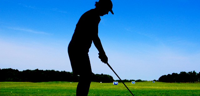
| I like the idea..it may just be the resolution, but the contrast and saturation seem over the top. |
|
|
|
07/18/2005 09:06:01 AM |
| Looks good in profile silhouette. Great color on the sky. |
|
|
|
07/17/2005 02:38:18 PM |
Tight cropping, but I like the picture. This really is as much action as you get in golf!
The idea is great but wish the lines were sharper - 7. |
|
|
|
07/16/2005 04:58:56 PM |
| I would like to see this cropped so there is not so much room behind him. You know reul of thirds and all that. Just a thought |
|
|
|
07/16/2005 01:16:05 PM |
| nice pic, to bad the head is cut out. |
|
|
|
07/16/2005 12:52:27 AM |
| Nice set up I like the comp exp is very good. Try cropping a little more on the left side other than that I really like it |
|
|
|
07/15/2005 12:43:57 PM |
| i think this would work better vertical. |
|
|
|
07/15/2005 06:34:51 AM |
| I think this would be a better shot if it were done vertical. I like the colors. |
|
|
|
07/14/2005 11:19:59 AM |
| Great shot if you hadn't chopped off the golfer's head <6> |
|
|
|
07/14/2005 08:52:42 AM |
| Why crop the bottom? Great postcard. |
|
|
|
07/14/2005 02:34:53 AM |
|
|
|
07/13/2005 09:04:11 PM |
| Great colors, nice siloette |
|
|
|
07/13/2005 07:49:57 PM |
| The crop is really awkward. The feet and head of the club shouldn't be cut (IMO) |
|
|
|
07/13/2005 02:45:49 PM |
| Too tight of a crop on the head. Very nice colors though. |
|
|
|
07/13/2005 01:16:53 PM |
| i think it would be beter to have placed the golfer to the left using the thirds rule |
|
|
|
07/13/2005 11:32:43 AM |
| nice color, little action. |
|
|
|
07/13/2005 06:39:07 AM |
| ya cut his feet of, oh my. |
|
|
|
07/13/2005 05:50:20 AM |
|
|
|
07/13/2005 04:50:49 AM |
| I really like this, and I'm not even a golfer. The colors are beautiful and the sillouhuete of the golfer sets the mood nicely. Compositionally, I think if the golfer were more to the left it might even be better so that the blue yardage markers are making a cleaner line away from the golfer and through the photo. That would also enhance the wide apect chosen for this shot. Nice shot! |
|
|
|
07/12/2005 09:20:20 PM |
| I wish you hadn't cut the top of the guy's head off. |
|
|
|
07/12/2005 08:35:07 PM |
nice color sauration, would of liked to see the top of his head if not the ground
but i like the wide cropping |
|
Home -
Challenges -
Community -
League -
Photos -
Cameras -
Lenses -
Learn -
Help -
Terms of Use -
Privacy -
Top ^
DPChallenge, and website content and design, Copyright © 2001-2025 Challenging Technologies, LLC.
All digital photo copyrights belong to the photographers and may not be used without permission.
Current Server Time: 04/07/2025 10:27:15 PM EDT.