| Author | Thread |
Comments Made During the Challenge  |
|
|
07/17/2005 06:35:23 PM |
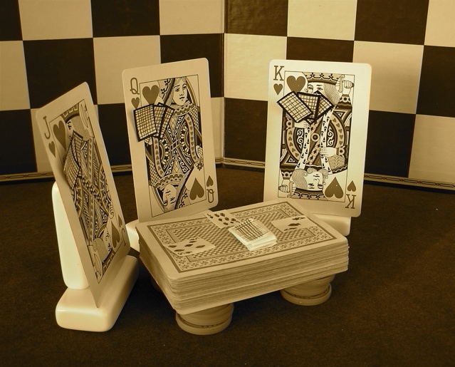
| Clever idea and nice props. I'm undecided if I'd like it more colorful or not; I'm guessing you checked out other versions as well. |
|
 Photographer found comment helpful. Photographer found comment helpful. |
|
|
07/17/2005 04:02:32 PM |
| LOL, took me a moment...Good execurtion. The 3-d effect of the cards being held by the "players" made the difference for me. Technically, very good, |
|
| Photographer found comment helpful. |
|
|
07/13/2005 07:12:33 AM |
| Good setup, thats a good shot, |
|
| Photographer found comment helpful. |
|
|
07/12/2005 07:46:50 PM |
|
| Photographer found comment helpful. |
|
|
07/12/2005 06:29:24 PM |
| that is so cute!! I'd give it an 8 or 9 if I could vote. |
|
| Photographer found comment helpful. |
|
|
07/12/2005 06:15:57 PM |
I'm not a fan of the coloring, it gives it a bland feeling when I think if the J Q and K were red the image would have a lot more impact. It might also help if the ground they were set on was more black.
I really like the idea though, it took a bit of staring to figure out what was going on ;) |
|
| Photographer found comment helpful. |
|
|
07/12/2005 12:03:29 PM |
| nice idea , creative and well staged ... lighting is not as balanced as a staged shot should be to me ... seems dull ... great idea though |
|
| Photographer found comment helpful. |
|
|
07/12/2005 11:15:49 AM |
| This shows both wit and originality! Very well done... |
|
| Photographer found comment helpful. |
|
|
07/12/2005 10:03:29 AM |
Fit to challenge criteria: 2 /2
Contrast/Colors: 1/2
Photo Quality: 1/2
Composition: 2/2
My subjective affinity: 2/2 |
|
| Photographer found comment helpful. |
|
|
07/12/2005 04:50:02 AM |
| very creative... do you think it is appreciated score wise? |
|
| Photographer found comment helpful. |
|
|
07/12/2005 04:37:43 AM |
|
|
|
07/11/2005 11:07:48 AM |
| Great start to a royal flush. I just had a sudden urge to go to the casino. |
|
| Photographer found comment helpful. |
|
|
07/11/2005 10:53:15 AM |
|
| Photographer found comment helpful. |
|
|
07/11/2005 10:08:29 AM |
| I have viewed this 5 times now. I still am having trouble relating this to the challenge. I can see where you wanted to go with your concept, just didn't do it for me. Family does not come to mind. Well composed - yes. Good lighting and creative. Just not for family IMO. |
|
| Photographer found comment helpful. |
|
|
07/11/2005 08:45:46 AM |
hahha thats funny very good idea
lighting could use some work though
7 |
|
| Photographer found comment helpful. |
|
|
07/11/2005 06:40:43 AM |
| :) Love the creativity! This one makes me giggle. |
|
| Photographer found comment helpful. |
|
|
07/10/2005 11:25:11 PM |
| lol - I do like humor. A family of cards is a family after all. Maybe brighten up the colors a tad |
|
| Photographer found comment helpful. |
|
|
07/10/2005 09:56:14 PM |
| Cute set-up here and such a neat idea. I don't really like the sepia or yellow hue, though. I think that desaturating everything but the red would have been neat and appropriate. This had to have taken A LOT of time to set up. Kudos and extra points for that and your creativity. |
|
| Photographer found comment helpful. |
|
|
07/10/2005 09:29:35 PM |
| Just too contrived for my taste. |
|
| Photographer found comment helpful. |
|
|
07/10/2005 08:48:59 PM |
| I like the concept and execution. Clever. |
|
| Photographer found comment helpful. |
|
|
07/10/2005 08:41:27 PM |
| thought and effort went in to this one. kudos on the creativity. |
|
| Photographer found comment helpful. |
|
|
07/10/2005 08:32:20 PM |
| This looks like it took a while to set up. I like it. 8 |
|
| Photographer found comment helpful. |
|
|
07/10/2005 08:19:08 PM |
| Very cute idea. I don't really care for the coloring....but I still give it a good 7. |
|
| Photographer found comment helpful. |