| Author | Thread |
|
|
07/13/2005 12:38:33 AM |
| Hard to see why you are languishing at 284!!!!! |
|
 Photographer found comment helpful. Photographer found comment helpful. |
|
|
07/12/2005 08:47:38 PM |
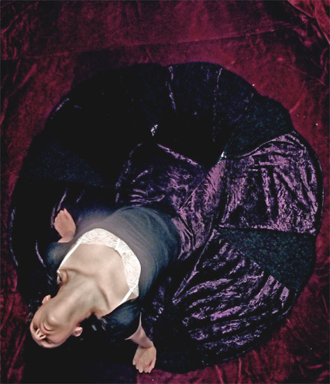
| what a creative idea...i would have never thought of putting my camera on a celing fan! a very unique entry for a very unique woman. this should have scored higher IMHO |
|
| Photographer found comment helpful. |
Comments Made During the Challenge  |
|
|
07/12/2005 02:19:11 PM |
| Very good composition. Nice shot. |
|
| Photographer found comment helpful. |
|
|
07/12/2005 09:37:36 AM |
We all know what the challenge title is. It is too bad that you could not take the time to be more creative with your titleing.
nice comp, nice lighting, nice b&w's, nice color, great motion, nice texture, overall nice job |
|
|
|
07/12/2005 06:12:04 AM |
| I really like this. The composition is great. Nice muted colours. Evocative. Original, bumping up to a 10 and a Fav. |
|
| Photographer found comment helpful. |
|
|
07/10/2005 06:01:42 AM |
| What a great idea. I wonder how it would have looked with a white floor? And the blurry bright spot on her chest is distracting. What about sepia ? |
|
| Photographer found comment helpful. |
|
|
07/10/2005 03:51:59 AM |
|
| Photographer found comment helpful. |
|
|
07/09/2005 11:21:51 PM |
| For this contest everyone who has the word �circle� in their title is getting a lower score. This is a copy and paste version that I am including in every photo that I downgrade due to the title. We as members of DPchallenge know the topic of the challenge � we do not need to reread the topic every time we reach a photo. If circle is in the title and it is appropriate I will most likely not down grade, but it better be good. I am sorry if you do not agree with my method of protest � but scores are all I have. (for your photo the title did not distract so no downgrade) |
|
|
|
07/09/2005 06:29:35 PM |
Subject Impact: Dosen't really grab me
Meets Challenge: Meets Challenge
Technical: Average technical form
Composition: Good
Creativity: Very Creative Idea
Score: 6 |
|
| Photographer found comment helpful. |
|
|
07/09/2005 10:42:03 AM |
| i love the attempt here. i wish the circle were totally visible, without the girl blocking it. i also don't like the extra red at the top. |
|
| Photographer found comment helpful. |
|
|
07/09/2005 09:09:08 AM |
| I love the idea here. It domes across a bit dark though, maybe a lighter backgound to seperate the subject. |
|
| Photographer found comment helpful. |
|
|
07/08/2005 11:59:30 AM |
| nice perspective and interesting shot ... I would have liked for the colors to be more vibrant and less harsh light on the model's chest |
|
| Photographer found comment helpful. |
|
|
07/08/2005 05:15:09 AM |
| this shot would look so much better with the face in top right corner - for natural "leading" feeling of the eye. Great idea, nicely done. |
|
| Photographer found comment helpful. |
|
|
07/07/2005 12:54:12 PM |
| Not the best pose... Are you trying to highlight the model's breasts? |
|
|
|
07/06/2005 06:43:03 PM |
I like this picture.
Two small quibbles: (1) I think the dancer's head pointing down is awkward, a 90- or 180-degree rotation would be better. (2) The colors either aren't bright enough or aren't dull enough. Pick a direction and desat a little for a sepia-toned, old-style image or increase for a brighter and impactful image.
7 |
|
| Photographer found comment helpful. |
|
|
07/06/2005 06:27:25 AM |
|
| Photographer found comment helpful. |
|
|
07/06/2005 12:49:24 AM |
| Strange position. I can't help but wonder if she leaned to the side if it would have looked better to me. Appears you may have desaturated a little. Her skin tones are ashen at her throat and breast with the bodice of the dress lacking color. There is definatly a clash of colors and textures. |
|
| Photographer found comment helpful. |
Home -
Challenges -
Community -
League -
Photos -
Cameras -
Lenses -
Learn -
Help -
Terms of Use -
Privacy -
Top ^
DPChallenge, and website content and design, Copyright © 2001-2025 Challenging Technologies, LLC.
All digital photo copyrights belong to the photographers and may not be used without permission.
Current Server Time: 04/07/2025 01:12:43 PM EDT.