| Author | Thread |
Comments Made During the Challenge  |
|
|
07/11/2005 11:41:03 AM |
| ok.. a nice pattern. good composition, but the colors are a bit dull. I guess the picture looks a little too bland / flat. great work of being under the light though. |
|
 Photographer found comment helpful. Photographer found comment helpful. |
|
|
07/07/2005 06:35:24 PM |
| I gave this a 9. what is it? |
|
|
|
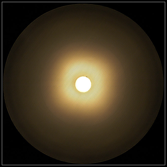
07/06/2005 07:25:27 PM |
| I don't know what this is, but I like the graphic design. The gradient is very pleasing to look at and your attention to detail in the symmetry is evident. My only nit (an this doesn't affect score at all) is the little dark spot at 1:o-clock. Since the placement of the white center pulls the eye right to it, the spot gets immediate attention. |
|
| Photographer found comment helpful. |
Home -
Challenges -
Community -
League -
Photos -
Cameras -
Lenses -
Learn -
Help -
Terms of Use -
Privacy -
Top ^
DPChallenge, and website content and design, Copyright © 2001-2025 Challenging Technologies, LLC.
All digital photo copyrights belong to the photographers and may not be used without permission.
Current Server Time: 04/09/2025 07:37:04 PM EDT.