| Author | Thread |
Comments Made During the Challenge  |
|
|
07/10/2005 06:40:45 PM |
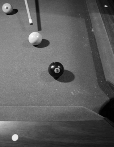
| Flat... put more Contrast in there... but nice idea |
|
 Photographer found comment helpful. Photographer found comment helpful. |
|
|
07/08/2005 01:54:06 PM |
| a bit flat, more contrast, less noise, sharper. |
|
| Photographer found comment helpful. |
|
|
07/06/2005 04:57:03 PM |
| Looks a bit snapshotty to me. Maybe if you put more thought into camera angle / point of view, etc. Make me see the shot from an interesting perspective. |
|
|
|
07/06/2005 03:58:59 PM |
| composition is ok, as well as framing, but the lighting is horrible. contrast is almost nonexistent for the majority of the photo |
|
| Photographer found comment helpful. |
|
|
07/06/2005 09:02:30 AM |
| good idea, but quite soft image. angle is unexciting (check out the pool shot that is ranked as no. 1 highest score on this site - works because it is a good angle). compositionally, the three balls do not sit compforatbly within the frame - and the area around the two sides makes an unsatisfying partial frame, where space is wasted. adding a hand might have added a human/interest touch as well. |
|
| Photographer found comment helpful. |
|
|
07/06/2005 06:02:40 AM |
could you have upped the contrast? it looks a little flat.
It also may have been advisable to clean the table first - 4 |
|
Home -
Challenges -
Community -
League -
Photos -
Cameras -
Lenses -
Learn -
Help -
Terms of Use -
Privacy -
Top ^
DPChallenge, and website content and design, Copyright © 2001-2025 Challenging Technologies, LLC.
All digital photo copyrights belong to the photographers and may not be used without permission.
Current Server Time: 04/08/2025 04:51:14 AM EDT.